Visualization
Data Notes
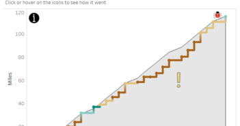
The data in this visualization is from a list of counties that I visited in July on a road trip. I used a google sheet to keep track of the counties. I looked up the counties every few days along the routes that we took using Wikipedia. I then categorized the county by what we did there. Once I got home, I made this map in Tableau. The bottom contains some key stats from the trip. If you want to see more info about my trip you can see it on this dashboard.
If you want to keep up with our surveys and data analysis, be sure to follow us on Twitter and Facebook.
The Map of My Summer Road Trip #dataviz https://t.co/7Usa4XuaoU pic.twitter.com/ZCky2mHBTR
— Overflow Data (@overflow_data) August 4, 2017


