Introduction
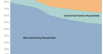
The American Community Survey (ACS), which is conducted by the U.S. Census Bureau measures the marital status of people living in America. When they publishes this data, they calculate estimates for marital status on everyone in the country that is 15 or older. Since there can be be big differences in the number of people that are married based on age and other variables, I decided to make this data visualization.
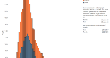
The graphic is powered by data tabulated using the 2016 ACS Public Use Microdata Sample. I did this so I could splice the data by age, sex, educational attainment, and ethnicity/race. Once I had these numbers, I used Tableau Public to create this visualization.
Visualization
Data Notes
The visualization always displays the percentage of the population that is 15 years old or older using the lines in the bar chart. You can adjust the age, sex, educational attainment and race/ethnicity of the population to see how marital status changes based on those traits.
Source: Tabulated from 2016 1 Year American Community Survey PUMS
Tool: Tableau
If you want to keep up with our surveys and data analysis, be sure to follow us on Twitter and Facebook.
What percentage of Americans have never been married? #dataviz https://t.co/dp63OJLCkQ pic.twitter.com/Po3HREJ7Og
— Overflow Data (@overflow_data) July 6, 2018


