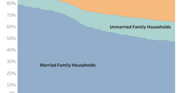
Visualization
Mobile Users: If you are having issues using the interactive version of this visualization, you can find a static version of it here.
Data Notes
I have moved a lot and the reasons for moving are very interesting to me so I created this visualization to get a better idea of why people move. I got this data from a tabulation done by the U.S. Census Bureau using Current Population Survey data. Once I had the data in a usable form I used Tableau to create the visualization.
If you want to keep up with our surveys and data analysis, be sure to follow us on Twitter and Facebook.
How the Congress Voted on the Repeal of FCC Internet Protections #dataviz https://t.co/gUv2MMoxr8 pic.twitter.com/BXpoKDMGoq
— Overflow Data (@overflow_data) March 30, 2017


