
Visualization
Data Notes
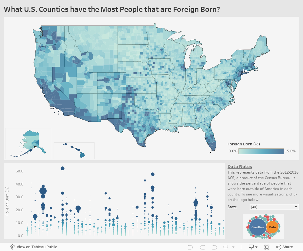
The data for this visualization comes from the American Community Survey which is conducted by the U.S. Census Bureau. I used the Census Bureau API to pull the 2016 5 year estimate for the percentage of the population that is foreign born. Once I had gathered the data, I used Tableau to create this visualization.
I have included the API code I used to pull the data below. You will need a free API key to access the data. You can find out more at the Census Bureau’s Developer Page.
https://api.census.gov/data/2016/acs/acs5/profile?get=NAME,DP02_0092PE&for=county:*&key=
If you want to keep up with our surveys and data analysis, be sure to follow us on Twitter and Facebook.
What U.S. Counties have the Most People that are Foreign Born? #DataViz https://t.co/HaDHGNfy1e pic.twitter.com/MPUkoKxqCD
— Overflow Data (@overflow_data) February 24, 2018
Leave a Reply