
Data Notes
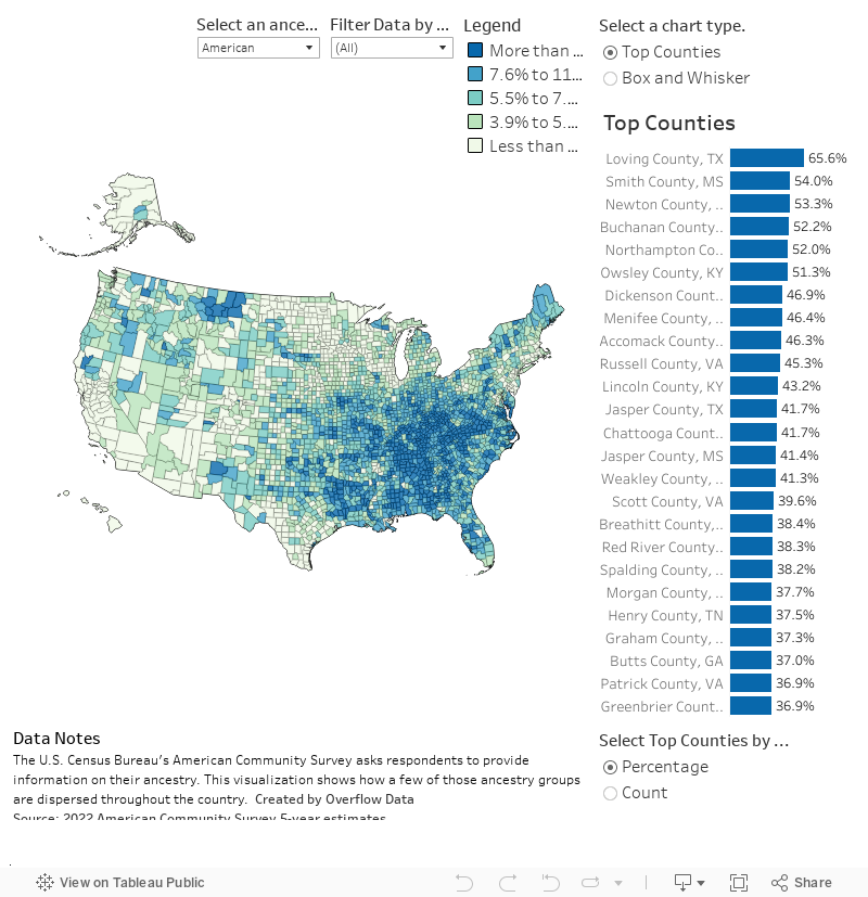
To celebrate Saint Patrick’s Day we created a data visualization to explore where people with Irish individuals live. We decided to go ahead and make a county level data visualization to show what areas of the United States have the most people with all the major ancestry groups the Census Bureau published data for in the American Community Survey. You can also select if you want to see the statisics as a percentage of the population or the total count. You can filter by state to see how things look in your state.
To gather this data, I used a python script to access the Census Bureau’s API. Specifically, the 2022 American Community Survey 5-year estimates. I then visualized the data using Tableau.
Follow @overflow_data on X, Instagram, or sign up to receive emails about our newest visualizations.