
Data Notes
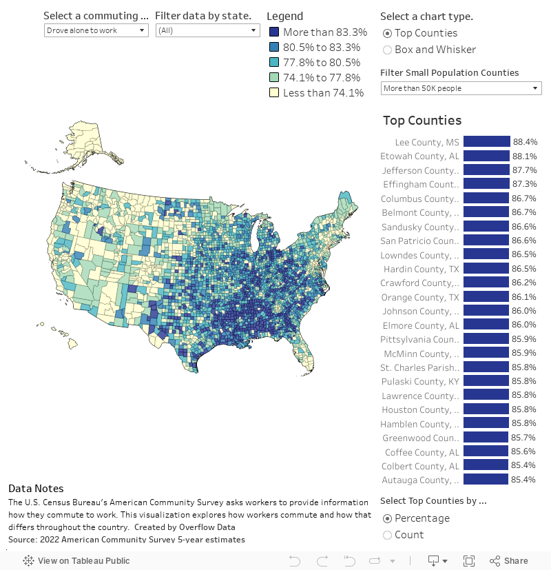
To celebrate Walk to Work Day, we created this county level data visualization to show how people get to work in each county in the United States. You can map different commuting methods, select population thresholds, and look at the map as a percentage of the population or the total count. You can also filter by state to see how things look in your state.
To gather this data, I used a Python script to access the Census Bureau’s API. Specifically, the 2022 American Community Survey 5-year estimates. I then visualized the data using Tableau.
Follow @overflow_data on X, Instagram, or sign up to receive emails about our newest visualizations.