
Visualization
Data Notes
A few months ago I created a visualization that allowed users to compare age distributions for various topics and another one that showed marital status by age range. I decided that I wanted to take a closer look at marital status and I thought this tool would give me a good base to start from. This visualization shows uses Tableau to show the marital status for every age.
The data for this visualization comes from the American Community Survey which is completed by the US Census Bureau. I used the 2014 One Year Estimates Public Use Microdata Sample which can be found on the ACS Website. Below, I have provided examples of the questions that are asked to create this data.
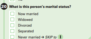
Marital Status
Sex
Pretty generic question here. You can select male or female.
![]()
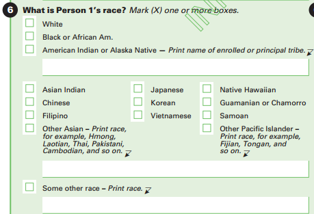
Race
The ACS has six basic race categories. You are able to choose between White, Black or African American, American Indian or Alaska Native, Asian, Pacific Islander or some other race.
Employment Status
This fields is broken out to let you see not only who is in the labor force and who isn’t, but it allows you to see age of those who are employed in the Armed Forces as well.
State
Geography often is associated with different trends. This allows you to look at the age distribution in different states.
If you want to keep up with our surveys and data analysis, be sure to follow us on Twitter and Facebook.
What is the Marital Status of Americans by Age? #dataviz https://t.co/4Lu73ah5tO pic.twitter.com/HdDQ2AKntp
— Overflow Data (@overflow_data) October 28, 2016
Label your axes.
The purple also represents happy.
might be interesting to see as a stacked 100% chart in addition to raw numbers. that would better show the impact of the contrasts
I’d like the Y-axis labelled with actual number of people; and the hover-over showing the fraction (over the total population) for that category.
Wonderful source of some great data. Thanks! For the marital status by age, etc. can you also add percentage functionality?
Yes, label the axes. And yes, present the data in several alternative views. For instance, this is the first plot that I have seen that shows a bump in deaths of people in their 50s. It would be interesting to expand on that.