Introduction
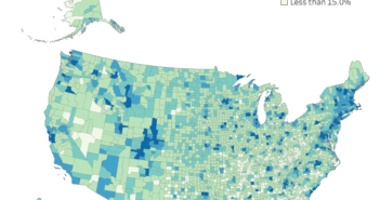
Last week to celebrate St. Patrick’s Day, we created a visualization showing the percentage of the population that is Irish. Later in this week I read that the same data source was used by the New York Times to show a correlation between the percentage of the population that says they have American ancestry and counties that support Donald Trump for president. After seeing this, I decided I wanted to take a look at what counties the had the most people reporting American ancestry. When I was doing this though, I realized I could create a visualization showing this for all the ancestries that are reported to the US Census Bureau.
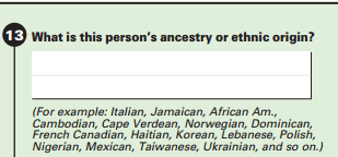
The mail version of the question that is asked is shown above as a reference.
The full American Community Survey form can be found here.
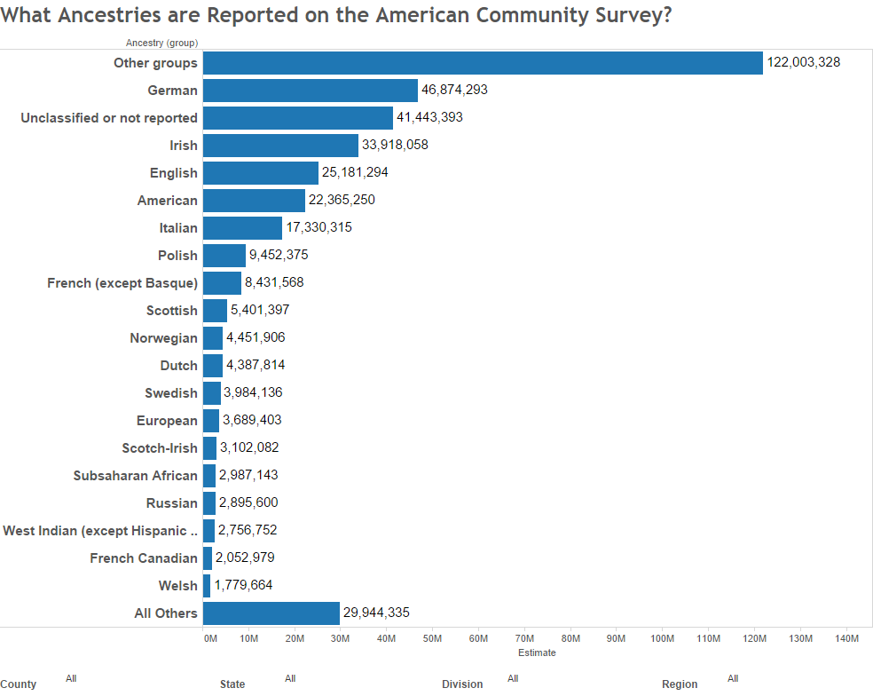
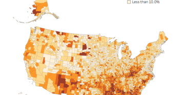
In the visualization below you are able to select the ancestry you are interested in and then view what percentage of the county reports having that ancestry. There is also a graphic of the most reported ancestries. You can also filter this information geographically and for certain population traits. Since individuals can report more than one ancestry and they don’t have to report it the results do not total to the sum of the total population.
Visualizations
If you are interested in an interactive version of the bar chart, you can find it here.
Data Notes
The data for this visualization comes from the United States Census Bureau. It is gathered during the American Community Survey. I used 2014, 5 Year Estimates for each U.S. county. This can be found at American Fact Finder under Table B04006. I used Excel and Access to create the data table. I then used Tableau to visualize it.
