
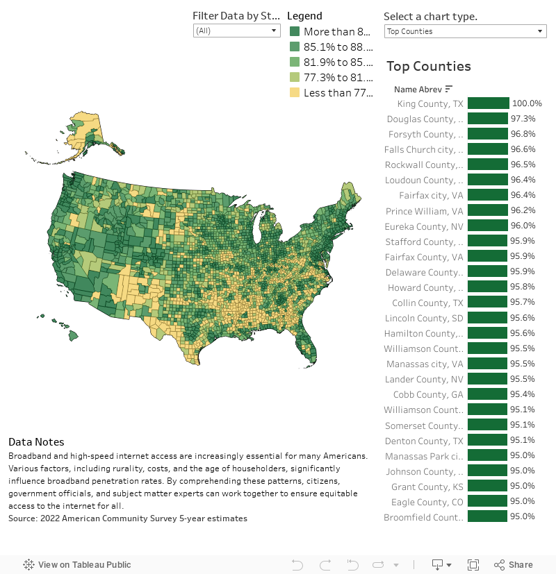
Data Notes
We developed this data visualization to shows which counties have the highest percentage of homes with high-speed or broadband internet access. Many counties on the list are higher than others and this can be influenced by a variety of factors. Some of these include factors include household income, age, educational attainment, but this graphic explores location and county level trends. Our hope is this tool will be a valuable resource for people to understand broadband uptake geographically.
To gather this data, I used a python script to access the Census Bureau’s API. Specifically, the 2022 American Community Survey 5-year estimates. I then visualized the data using Tableau.
Follow @overflow_data on X, Instagram, or sign up to receive emails about our newest visualizations.