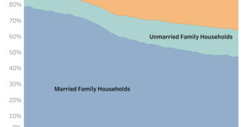
Visualization
Mobile Users: If you are having issues using the interactive version of this visualization, you can find a static version of it here.
Data Notes
In the past, I have created a graphic showing the number of Americans married last year by age using data published by the American Community Survey. Since then, new data has been published for the Census Bureau so I updated my visualization.
I used the 2017 One Year Estimates Public Use Microdata Sample to create this visualization. The data can be found on the ACS Website. I then utilized Tableau to visualize the data. If you are interested in more data like this be sure to look at my “How American’s Differ by Age” dataviz.
If you want to keep up with our surveys and data analysis, be sure to follow us on Twitter and Facebook.
How Old Are Newlyweds in the United State? #dataviz https://t.co/2KYyl3RDJ1 pic.twitter.com/F1xuNMISKa
— Overflow Data (@overflow_data) April 22, 2019


