Introduction
A few weeks ago, we created a visualization showing how the number of hours usually worked in a week differ for males and females. We decided to take it a step further and show how the amounts people earn differ based on their sex. Below you will find a visualization showing median wages earned and the distribution of wages of both male and female workers. Filters are available to adjust the tool for viewing different scenarios.
Visualization
Mobile Users: If you are having issues using the interactive version of this visualization, you can find a static version of it here.
Variables
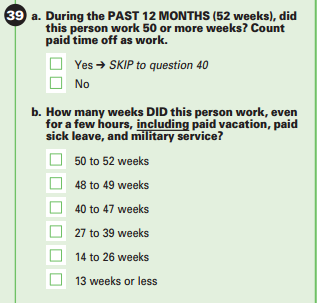
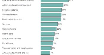
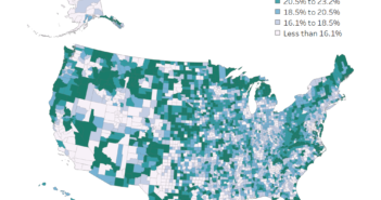
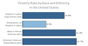
There are a number of different variables that are displayed and that you can adjust. Here are some images of the variables that are used in the dataviz.
Sex
Wages
Hours Worked
Weeks Worked

Data Notes
To create this visualization I used data published by the American Community Survey, a product of the US Census Bureau. I utilized the 2015 One Year Estimates Public Use Microdata Sample. The data can be found on the ACS Website. Once I had the data, I used Tableau to visualize the data. I grouped the “Wages” variable into the groups I wanted, formatted it, and published the visualization on Tableau Public.
It is worth pointing out that two major variables we are missing are length of time working at a job or in your field and a variable for the occupation of these workers. The ACS doesn’t capture information about how long someone has worked in a given field. It would have been nice to have added the occupational data, but there a hundreds of occupation codes and we decided that was too daunting of a task to incorporate here, but hope to do so in the future.
Creating a perfect analysis of this would be nearly impossible, but for the most part, this data visualization seems to support the findings that on average women make less than men. You have to interpret these results based on the limitations we mentioned though. If you have any questions about these limitations or the data visualization be sure to leave a comment below or reach out to us on Twitter.
If you want to keep up with our surveys and data analysis, be sure to follow us on Twitter and Facebook.
#dataviz https://t.co/mUzlAJLMEi pic.twitter.com/gqDrklrpgZ
— Overflow Data (@overflow_data) March 29, 2017


