Introduction
Earlier this week I published a visualization of how long it takes the average American to travel to work. This visualization included breakdowns on how long it can take based on transportation method, age range, class of worker, and the state a person resides. An area that could definitely use a closer look is the geography.
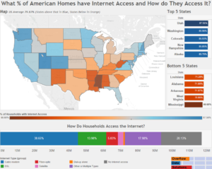
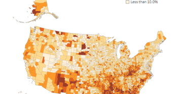
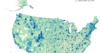
Once of the issues with looking at the state average is the urban areas can make the state average seem much higher than some of the more rural areas. By looking at counties it is much easier to see some of the different trends. The visualization below lets you explore the state and county averages.
Visualizations
Data Notes
The data for this visualization comes from the United States Census Bureau. It is gathered during the American Community Survey. I used 2014, 5 Year Estimates for each U.S. county. This can be found at American Fact Finder under Table B04006. I used Excel and Access to create the data table. I then used Tableau to visualize it.


1 Comment
I’ve been surfing on-line greater than three hours these days, yet I never found any attention-grabbing article like yours. It?¦s beautiful value enough for me. Personally, if all webmasters and bloggers made good content as you did, the net will probably be much more useful than ever before.