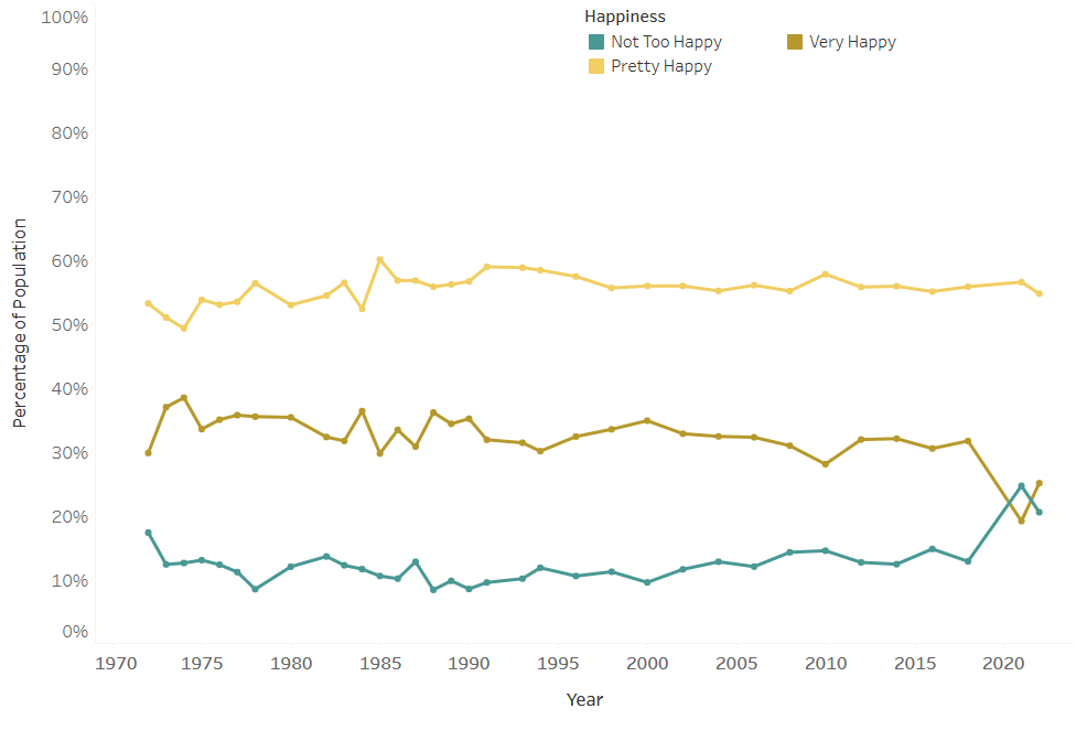
Are Americans Becoming More or Less “Happy”?
Overall people seem less happy than ever, but they may be happier than you think. In this viz we look at the chaning dynamics of being “Happy.”
Overall people seem less happy than ever, but they may be happier than you think. In this viz we look at the chaning dynamics of being “Happy.”

This visualization uses data from the U.S. Census Bureau’s Current Population Survey, 2024 Voting Supplement. It highlights how voting patterns vary across different demographic characteristics. […]
As America continues to shift demographically, the aging population has become a much larger focus for policy makers. Understanding where the oldest Americans live, and […]
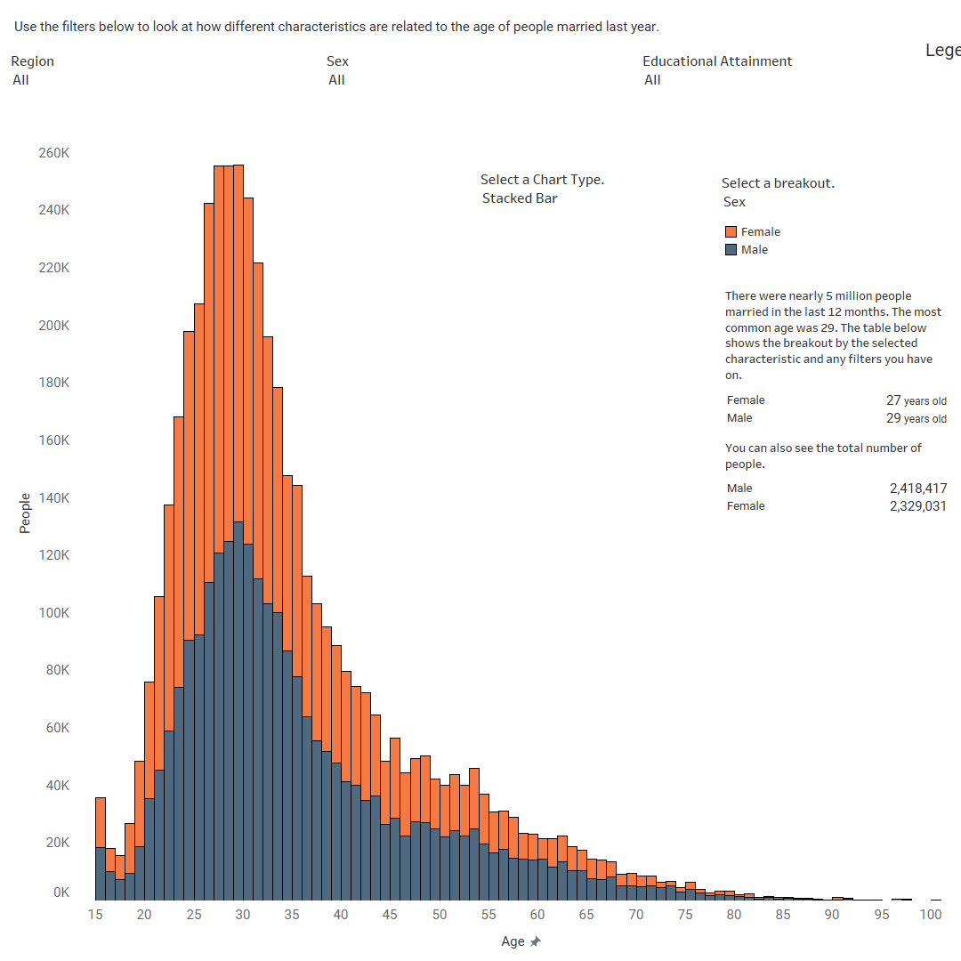
Nearly 5 million people got married in 2022. This data visualization looks at how old each of those people are.
Copyright © 2026 | WordPress Theme by MH Themes