
Data Notes
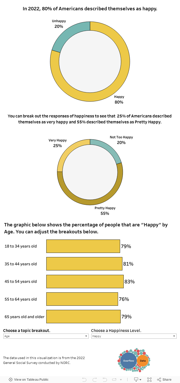
The data in this visualization comes from the 2022 General Social Survey which is conducted by NORC. They asked respondents, “Taken all together, how would you say things are these days–would you say that you are very happy, pretty happy, or not too happy?” Once I gathered the data it was cleaned in python and visualized in Tableau.
Happiness seems to be related to characteristics such as health, age, income, and marital status. You can check out the other visualizations we have on those topics to learn more about them.
Leave a Reply