Introduction
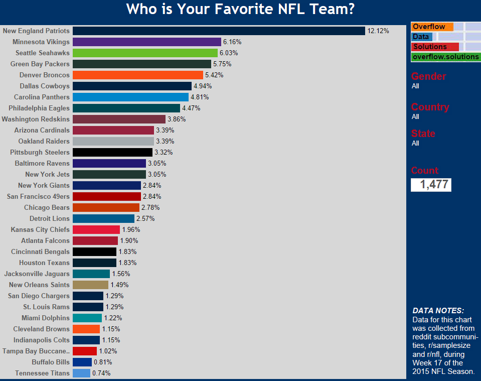
Earlier today I published the results of my survey of r/samplesize and r/nfl. The post was suppose to provide intuitive tools that simply displayed the data that I gathered on who people’s favorite NFL team is. The response that I got back about the visualizations, made it clear that this wasn’t the case.
I had gotten such a positive response on the initial survey, I didn’t feel right doing a cruddy job on the visuals. I decided that I would take one more shot at creating a good visual representation of the data.
Visualization

[accordions]
[accordion title=”A Note for Mobile Users” load=”hide”]How to integrate mobile users in the visualization realm continues to be an issue for users and creators. At this current time we are only publishing desktop ready versions of our graphics. That doesn’t mean we don’t want you to see them. We just hope that you use the sharing features below to facebook, tweet, or email yourself the link so you can enjoy the visualization later. A mobile friendly version of this data is <u><span style=”color: #0066cc;”><a href=”http://overflow.solutions/exclusive-surveys/favorite-nfl-team-survey-week-17-results/”>located here</a></span></u>[/accordion]
[/accordions]
Special Thanks
I want to give a shout out to reddit user, u/Sutekhy. He was very critical of the initial design, but he was extremely helpful in helping me make the visualization better. I really appreciate the help!
The Survey
I am planning on leaving the survey open at this time. I will update it each week as I continue to get responses. I would really appreciate you taking a few seconds to complete it if you have a chance.


1 Comment
Simply wish to say your article is as astonishing. The clearness in your post is just nice and i can assume you are an expert on this subject.
Fine with your permission allow me to grab your RSS feed to keep updated with forthcoming post.
Thanks a million and please carry on the gratifying work.