Visualization

Data Notes
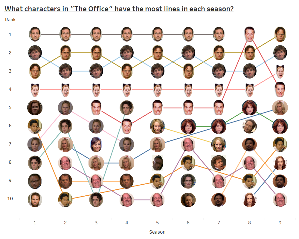
I am a big fan of “The Office” so when I saw r/dataisbeautiful was using data from “The Office” for the “Dataviz Battle of the Month” I knew I needed to create an entry. This visualization tracks what 10 character had the most lines when you look at each season. For those that our fans of the show, I think it helps to give an overview of the history of the show.
To create this visualization, I used the provided data for the contest. I utilized gimp to make the icons of the character’s faces and Tableau to create the visualization.
You were forwarded to this static version of the graphic because you are on a mobile device. Check it out on desktop or tablet to use some of the interactive features.
If you want to keep up with our surveys and data analysis, be sure to follow us on Twitter and Facebook.
What characters in "The Office" have the most lines in each season? #dataviz https://t.co/mVVuq8WxTq pic.twitter.com/2KLWTUPRIe
— Overflow Data (@overflow_data) April 28, 2018


