What Metro Areas Have The Worst Commutes? – Gallery
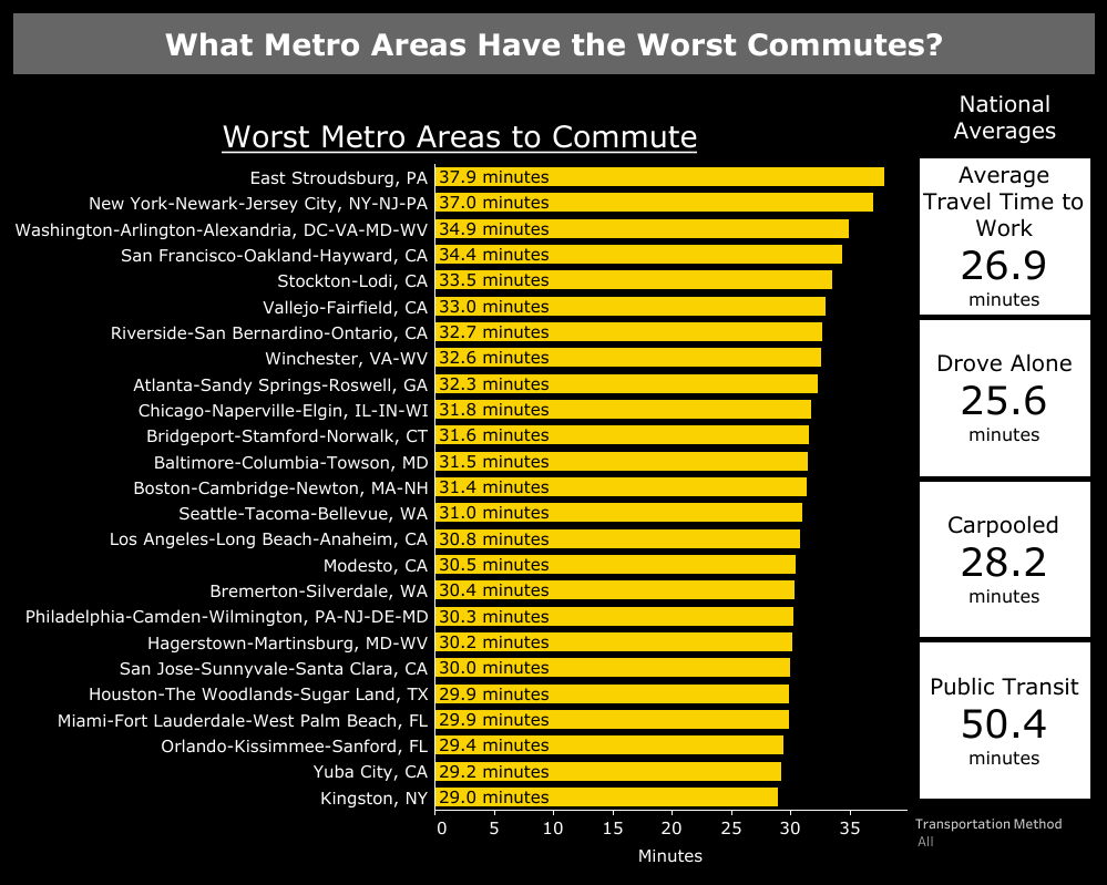
America is full of long commutes, especially in urban areas. These data viz show where the worst commutes are for drivers and those that use public transit.
America is full of long commutes, especially in urban areas. These data viz show where the worst commutes are for drivers and those that use public transit.
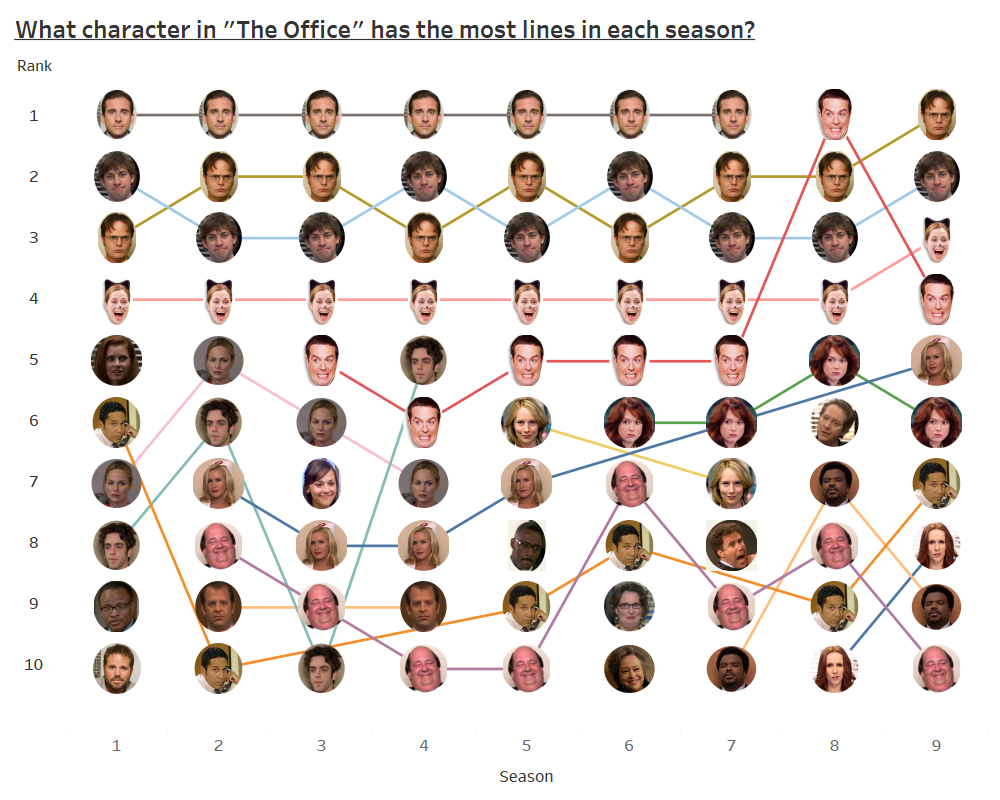
A view at how the characters with the most lines changed season by season in “The Office”.
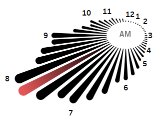
Our gallery view of when Americans get to work each day.
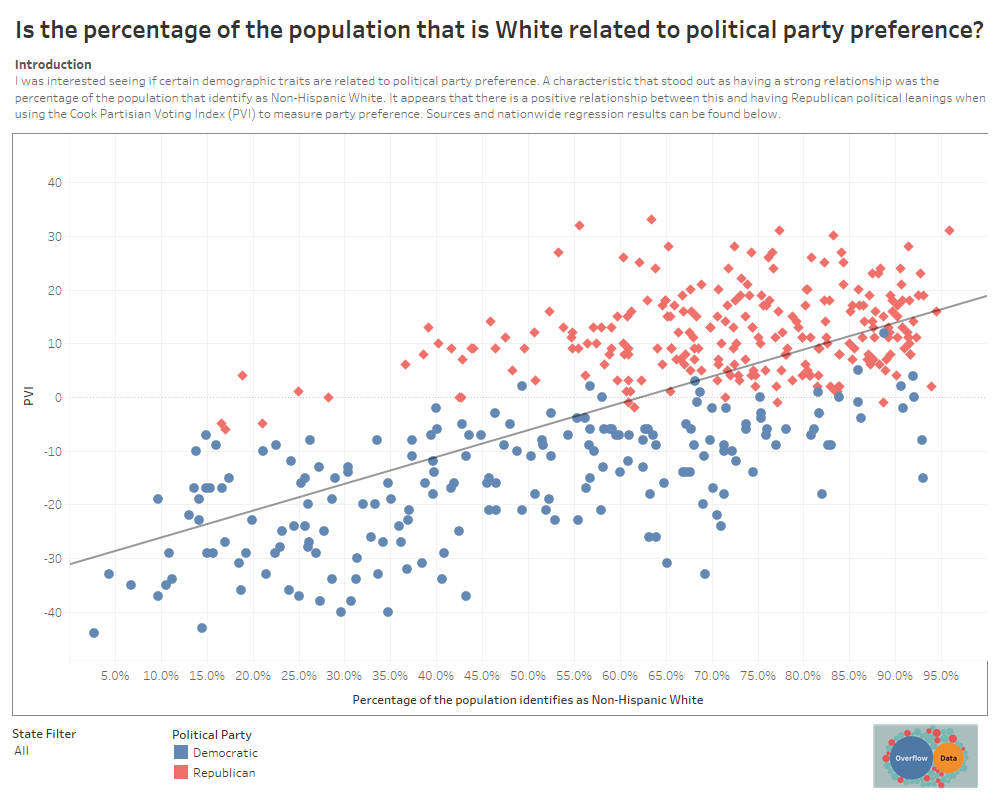
Our gallery view of the relationship between Race and political party preference in U.S. Congressional Districts.
Copyright © 2026 | WordPress Theme by MH Themes