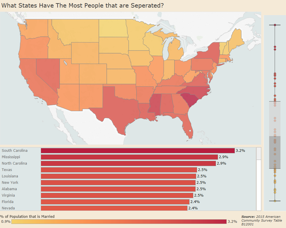
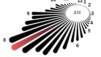
Visualization
Data Notes
The data used in this visualization is compiled by the US Census Bureau which produces the American Community Survey. I used the 2015 one year estimates from table B12001 from American Fact Finder. I used Excel to clean the data and Tableau to create the visualization.
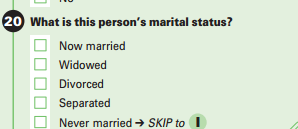
For this question, respondents have 5 responses that they can choose from. Only respondents that are 15 years or older have there responses tallied in this total. A screenshot of the question has been included below.
If you want to keep up with our surveys, data analysis, or want more data about marital status be sure to follow us on Twitter and Facebook.
What States Have The Most People that are Separated? #dataviz https://t.co/v3IRPdYWMF pic.twitter.com/O5Mqw2cviy
— Overflow Data (@overflow_data) November 20, 2016
