Introduction
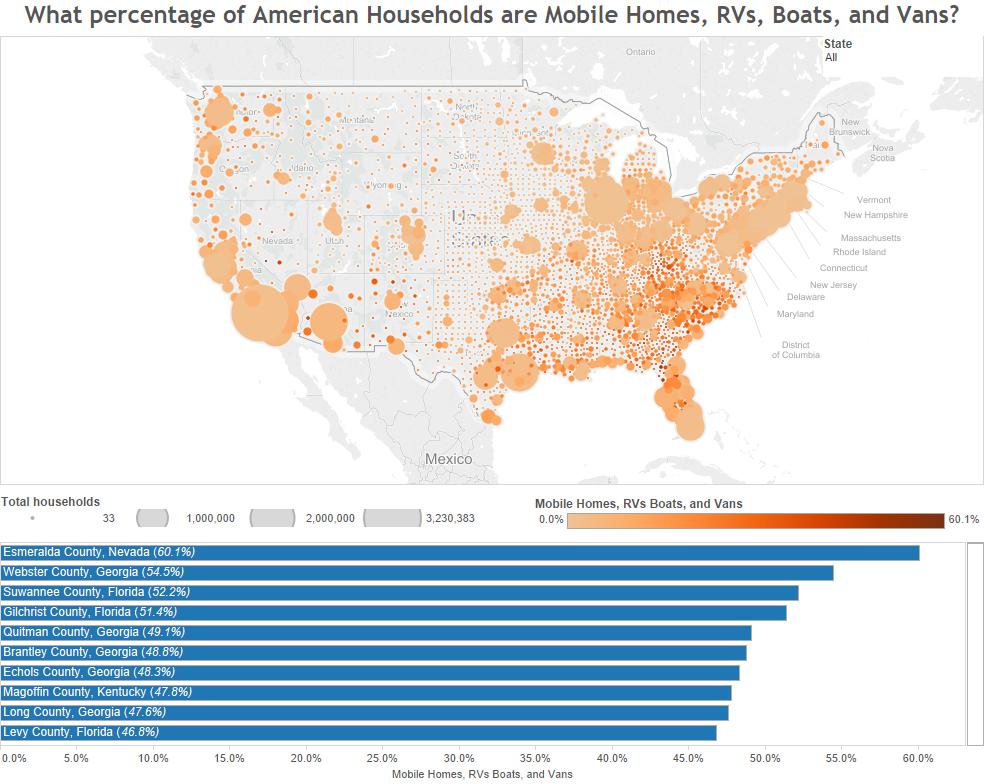
There are 115,610,216 homes in America which house the nation’s more than 300 million residents. Of those homes, the American Community Survey estimates that about 6.0% of them are mobile homes, RVs, boats, and vans.
This can differ by county though. Some counties have up to 60% of the homes in the county that are mobile homes, RVs, boats, and vans. Others seem to have none. The graphic below shows what counties have the largest percentage of these homes in their borders and which have the lowest. The color represents the percentage and the size of the bubble represents the number of homes in that county.

[accordions]
[accordion title=”A Note for Mobile Users” load=”hide”]How to integrate mobile users in the visualization realm continues to be an issue for users and creators. At this current time we are only publishing desktop ready versions of our graphics. That doesn’t mean we don’t want you to see them. We just hope that you use the sharing features below to facebook, tweet, or email yourself the link so you can enjoy the visualization later.[/accordion]
[/accordions]
Source
The data for this visualization came from the American Community Survey which is conducted by the United States Census Bureau. The data can be found at American FactFinder under Table S1101, 2013 5 year estimates. The visualization was created with Tableau.


