Visualization
Data Notes
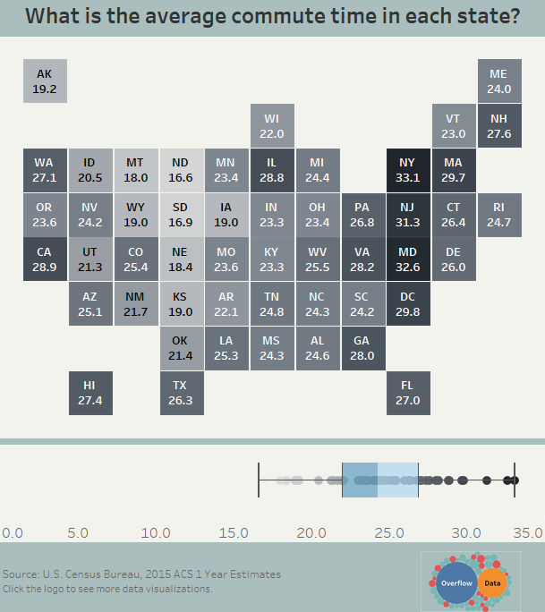
The data for this visualization comes from the American Community Survey which is conducted by the U.S. Census Bureau. I used the Census Bureau API to pull the 2015 1 year estimate for the percentage of the population with public health insurance. Once I had gathered the data, I used Tableau to create this visualization.
If you want to keep up with our surveys and data analysis, be sure to follow us on Twitter and Facebook.
What is the average commute time in each state? #dataviz #TileMapTuesday https://t.co/U4lmNl7Fbt pic.twitter.com/aCug2mGId5
— Overflow Data (@overflow_data) June 21, 2017


2 Comments
The data needs some units. Like mins / day , hours / week etc.
Thanks for the input Asim! We appreciate it.