-client=”ca-pub-6727653045041672″ data-ad-slot=”5089418743″ data-ad-format=”auto”>Introduction
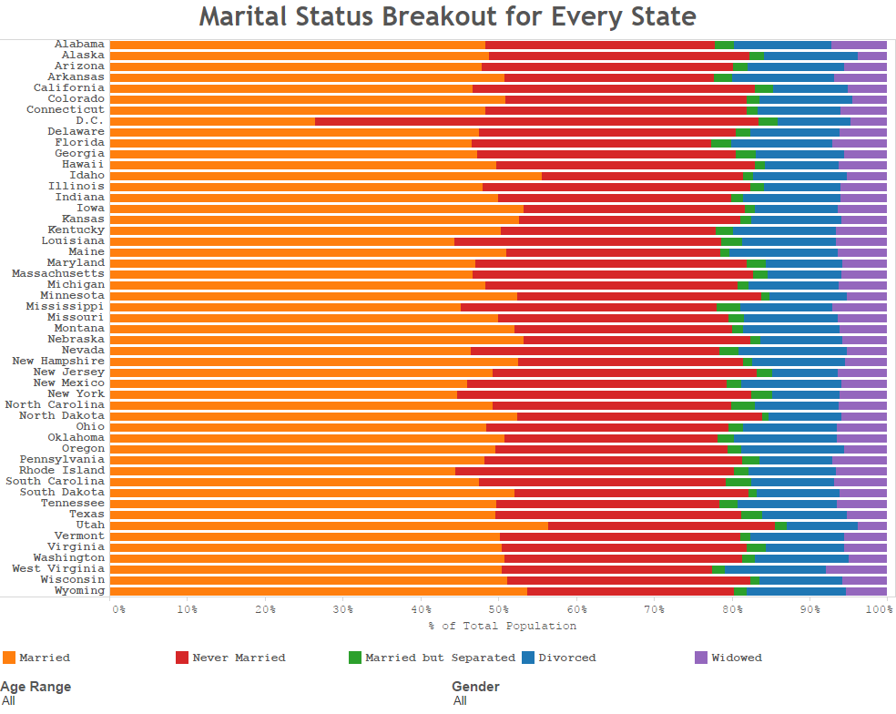
For this Valentine’s day, we wanted to take a statistical view of relationship statuses throughout the U.S. Below, you are able to see how marital status differs in each state. If you are on your PC, you are able to filter the breakout to see how this changes by age range and gender.
Visualization

Source
The data from this survey comes from the American Community Survey, which is conducted by the US Census Bureau. The 2010-2014 5 year estimates were used from Table B12002. This data can be found at American FactFinder. Excel was used to edit the data. Tableau was used to create the visualizations.


1 Comment
Me and this article, sitting in a tree, L-GE–RAN-I-N–!