Source
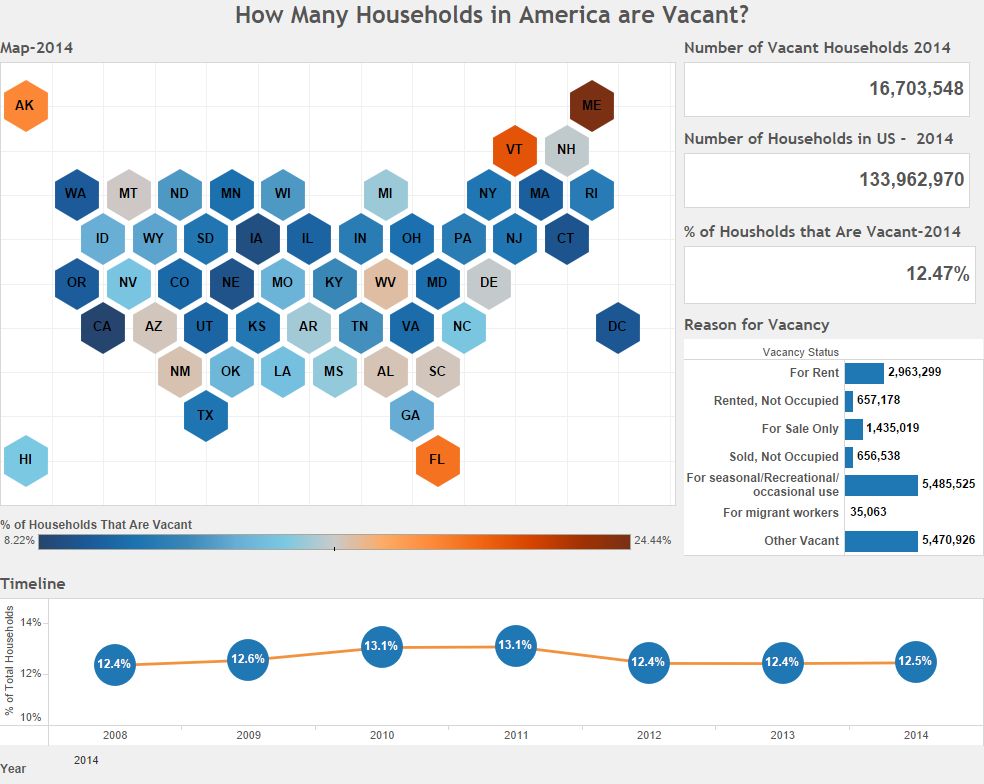
The data for this visualization comes from the United States Census Bureau. It is gathered during the American Community Survey. I used 2008-2014, 1 Year Estimates for this visualization. The mail version of this question is shown below. Since this is a custom tabulation, I had to use the ACS PUMS Microdata.
After downloading the data, World Programming System, Microsoft Excel, and Tableau were used to create this visualization. If you have any questions go ahead and leave me a comment.
If you want to keep up with our surveys and data analysis, be sure to follow us on Twitter and Facebook.
Up Next
What Percentage of Americans are in College?


