
Visualization
Data Notes
I have seen some very cool visualizations the last couple of days on r/dataisbeautiful that have been created by u/minibug and u/ThatBrokeCollegeDude. I had done something similar on my road trip dashboard, but I wanted to spruce it up after seeing the visuals on reddit.
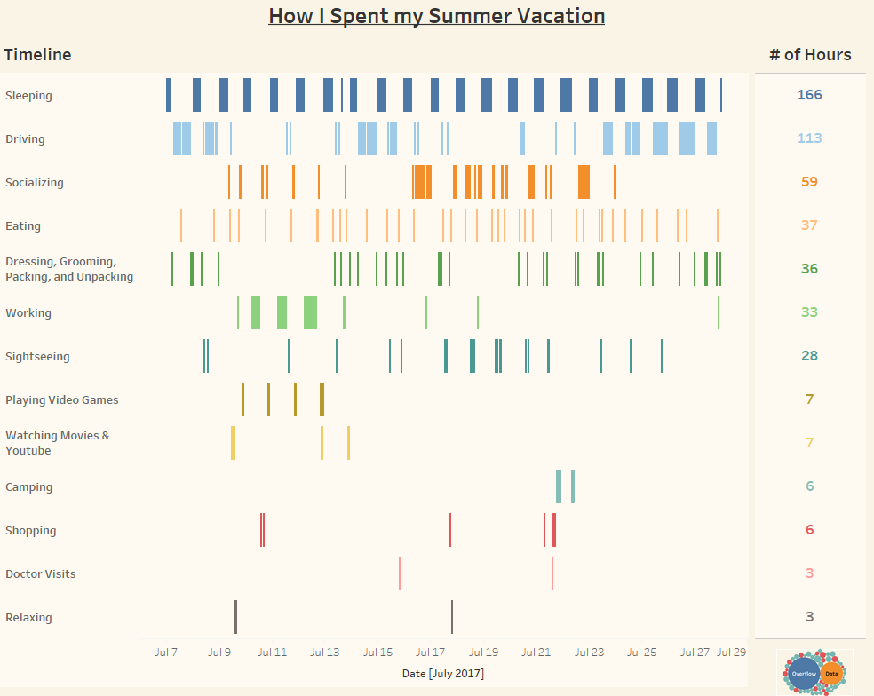
The graphic above shows how I spent the hours over the three weeks I had for summer vacation to visit relatives in Texas, Utah, and Idaho. I used Google Sheets to keep track of what I spent the majority of each hour we were on the trip. You can see the activities and about how many hours I spent doing them. I connected this data to a Tableau to create this visualization.
If you want to keep up with our surveys and data analysis, be sure to follow us on Twitter and Facebook.
How I Spent my Summer Vacation #dataviz https://t.co/MSk1v7keIL pic.twitter.com/rJlx5ZzfGq
— Overflow Data (@overflow_data) August 27, 2017
Leave a Reply