Introduction
Last week the US Census Bureau released its most recent population estimates. I used this data to calculate the population growth between July 1st, 2014 and July 1st, 2015. You can use the visualization below to see how the population totals have changed in each state and county.
Visualizations
Source
The data for this visualization comes from the United States Census Bureau. It is gathered during the Current Population Survey. After downloading the data, Microsoft Excel and Tableau were used to create this visualization. If you have any questions go ahead and leave me a comment.
If you want to keep up with our surveys and data analysis, be sure to follow us on Twitter and Facebook.
Up Next
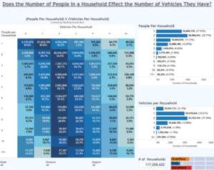
Does the Number of People in a Household Affect the Number of Vehicles They Have?

