Introduction
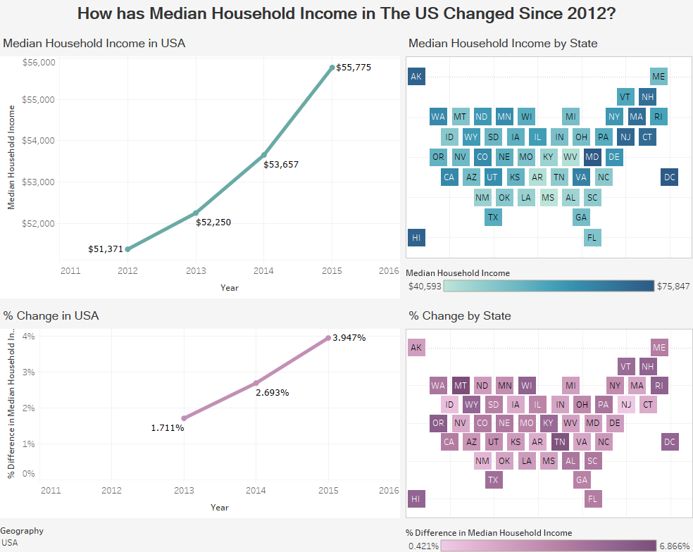
The Census Bureau has released new income data this week showing an upward trend in median incomes in the US. While the media seemed please with the upward trend overall. We thought it would be interesting to take a look at not only the US, but each state. The visualization below shows how the median household income is changing in each state.
Visualization
Data Notes
The data for this visualization comes from the American Community Survey which is conducted by the US Census Bureau. The data was gathered using the Census’s API, cleaned in excel, and visualized in Tableau. Information about the API software can be found here.
If you want to keep up with our surveys and data analysis, be sure to follow us on Twitter and Facebook.


