Introduction
You most likely found this page because you were having issues with our interactive visualization of “How Do Americans Differ by Age?”. Presenting data visualizations in a mobile format is an art that we are attempting to perfect, but are still getting the hang of. We hope that you can enjoy these static graphics of the complete data visualizations and will come back later to try out our tool.
Visualizations
[accordions]
[accordion title=”Educational Attainment” load=”show”]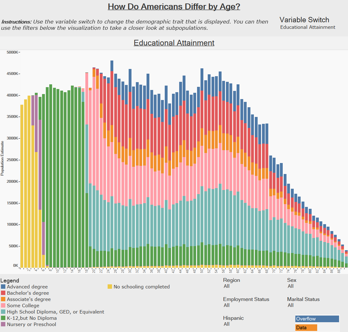 [/accordion]
[accordion title=”Employment Status” load=”hide”]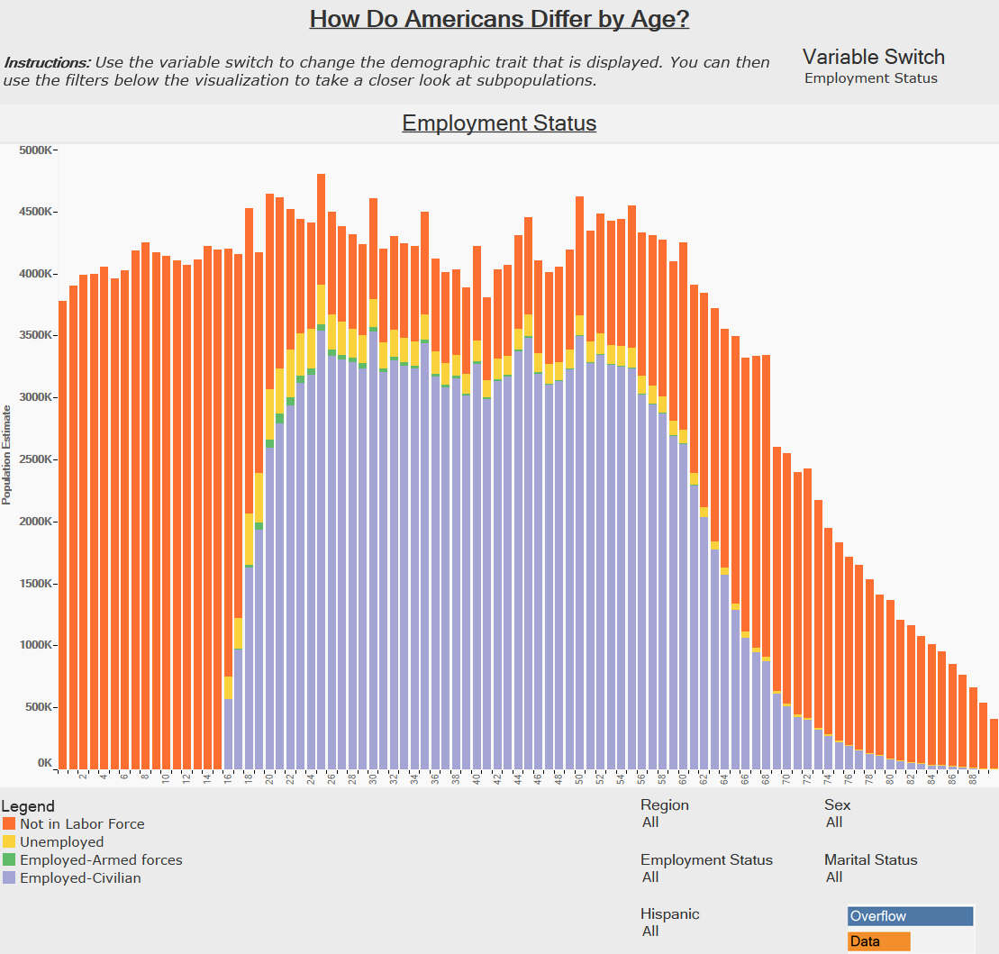 [/accordion]
[accordion title=”Marital Status” load=”hide”]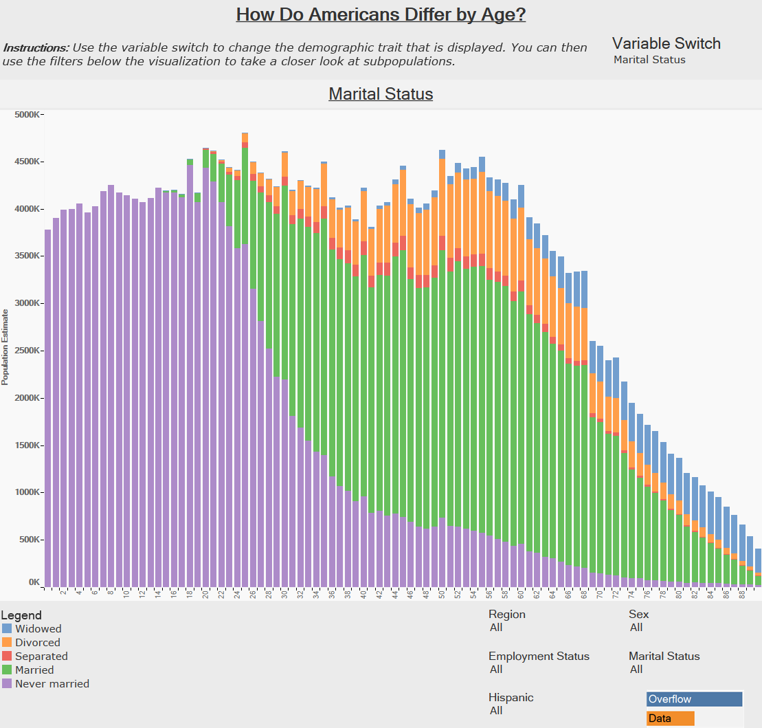
[/accordion]
[/accordions]
[accordion title=”Educational Attainment” load=”show”]
 [/accordion]
[accordion title=”Employment Status” load=”hide”]
 [/accordion]
[accordion title=”Marital Status” load=”hide”]

[/accordion]
[/accordions]
If you want to keep up with our surveys or data analysis be sure to follow us on Twitter and Facebook.
What States Have The Most People that are Separated? #dataviz https://t.co/v3IRPdYWMF pic.twitter.com/O5Mqw2cviy
— Overflow Data (@overflow_data) November 20, 2016
