Introduction
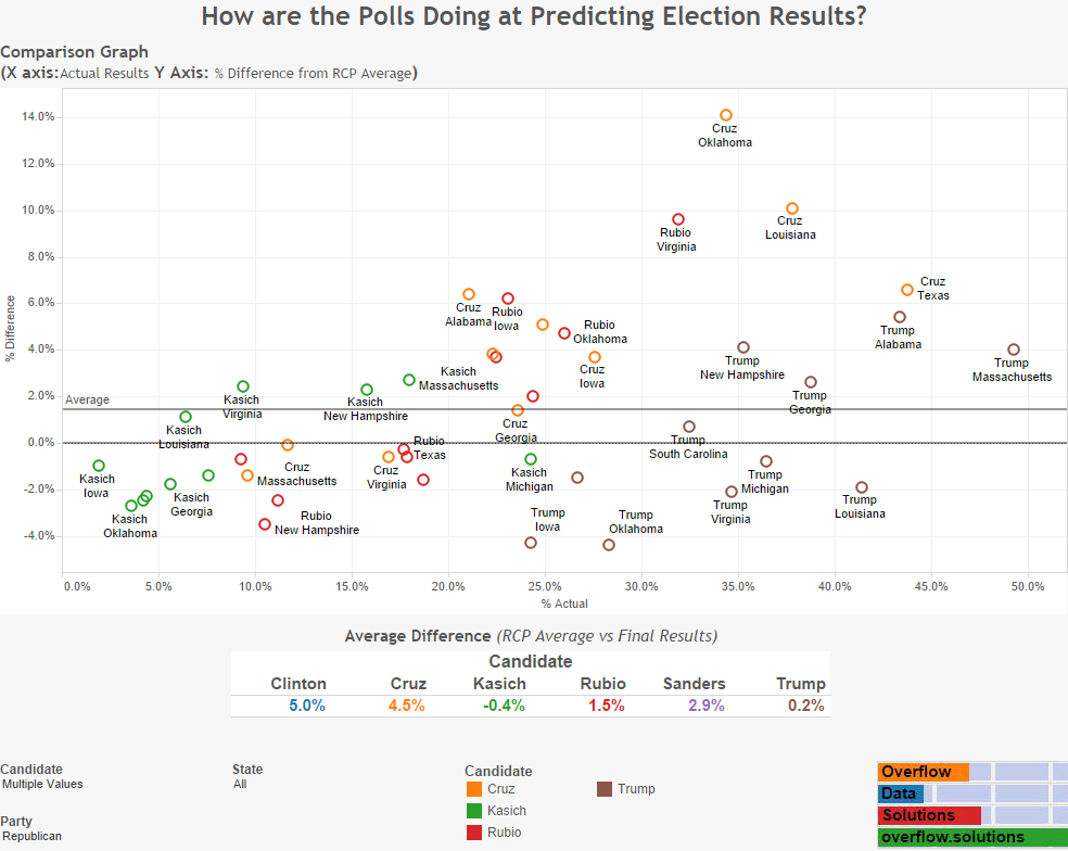
People are always curious about how good of job the polls are doing at predicting election results. After the Democratic Primary in Michigan, I wanted to take a look at how well the polls are doing in each state. To visualize this I took the Real Clear Politics average and the actual election results in all the states that this data was available for. Below, you are able to find a couple visualizations that help to show the differences between the two.
Visualization
Republican
Democratic

Note: Both Y Axes appear to be the same size, but they auto adjust. The Democratic results have a wider range then the Republican results.
Source
The data for these visualizations come from the Real Clear Politics website. Excel was used to edit the data. Tableau was used to create the visualizations.
If the state has voted, and it is not listed, there were not enough polls conducted to create a RCP average.
If you want to keep up with our surveys and data analysis, be sure to follow us on Twitter and Facebook.
Up Next
How has the Median Age Changed in the US Over the Last 10 Years?
Very nice article, totally what I wanted to find.