Introduction
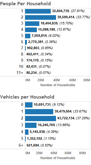
I have been curious for awhile now about data regarding the number of vehicles people have at their home. I decided that instead of simply looking at just the number of cars people have. I would compare it against the number of people that live in the house.
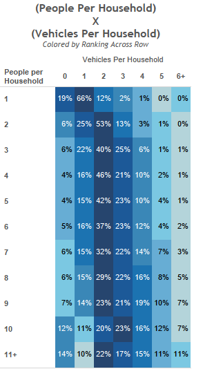
The graphic below shows the number of households that fall into each category. It also shows the total percentage of homes that fall in that category when comparing households with the same number of people. It has been colored to show which category has the most responses among households with the same number of people.
Visualizations
Data Notes
It is very interesting that on the national level, the most common scenario is a household with two vehicles in almost every category other than one person household and a household with ten people. The percentage decreases as the number of people in the households increases, but its not until you get to ten household members that three vehicles becomes the most likely situation.
To get a better idea of what is happening it would probably be beneficial to look at the age of the household members and the income. Age and income may be why households with a lot of people don’t have additional vehicles on average.
Source
The data for this visualization comes from the United States Census Bureau. It is gathered during the American Community Survey. I used 2014, 1 Year Estimates for this visualization. Since this is a custom tabulation, I had to use the ACS PUMS Microdata.
After downloading the data, Microsoft Access and Tableau were used to create this visualization. If you have any questions or concerns about the process go ahead and leave me a comment.
