Introduction
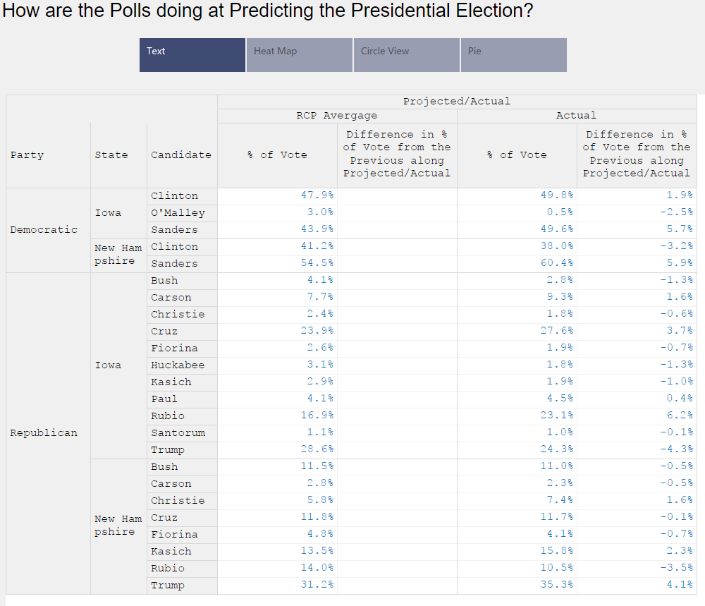
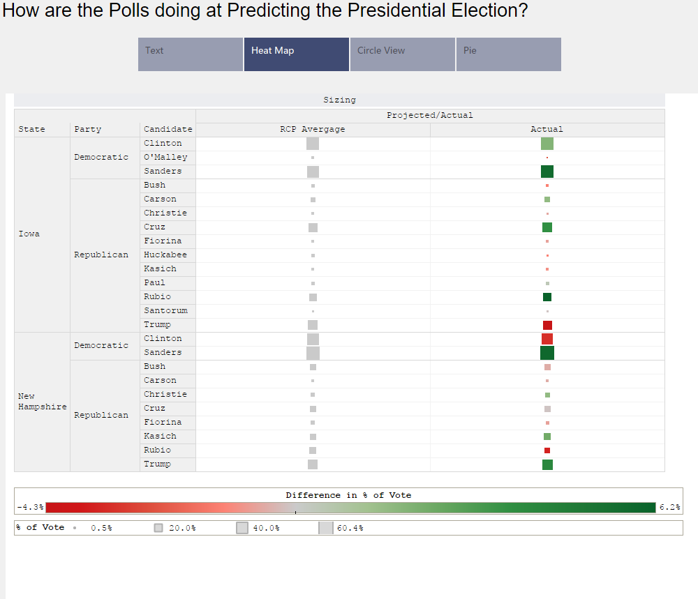
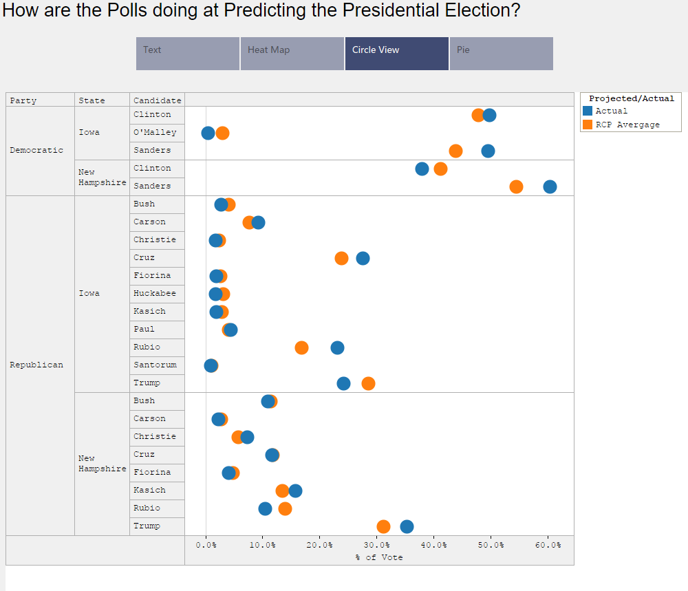
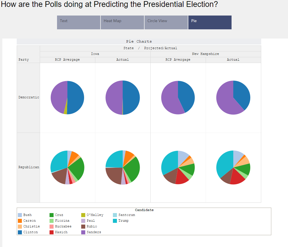
After Donald Trumps loss in Iowa, I have been curious how good of job the polls are doing at predicting election results. To visualize this I took the Real Clear Politics average and the actual election results for Iowa and New Hampshire. Below, you are able to find a few visualizations that help to show the differences between the two.
Visualizations
Text
Heat Map
Circle View
Pie Charts
Source
The data for these visualizations come from the Real Clear Politics website. Excel was used to edit the data. Tableau was used to create the visualizations.
If you want to keep up with our surveys and data analysis, be sure to follow us on Twitter and Facebook.
Up Next
How has the Median Age Changed in the US Over the Last 10 Years?
Leave a Reply