Introduction
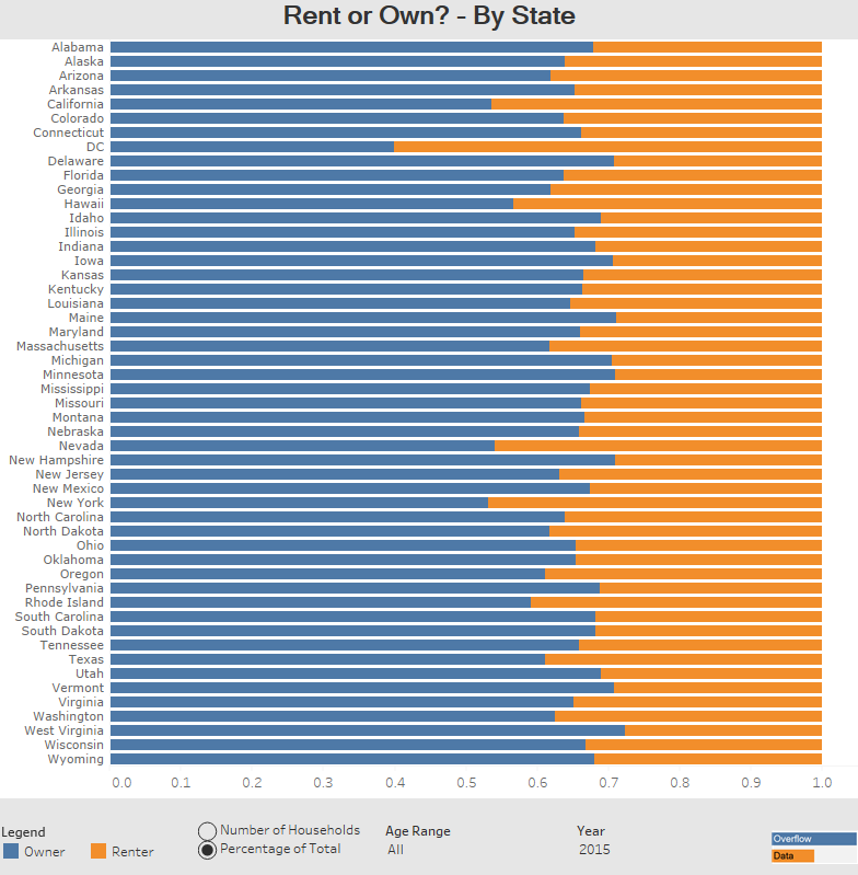
Since the recent economic recession, more people are renting homes and less people are buying them. On average, households are still more likely to be owned than rented, but how many people own their home can vary by state. This visualization shows how many households are owned or rented in each state. The visualization also lets you look back to 2005 and filter by age of the person that pays for the home to see how the proportions differ.
Visualization
Data Notes
To create this data visualization I gathered data from the American Community Survey on American Fact Finder. I used Table B25007 and the data from 2005 to 2015. I then manipulated the data in excel and used Tableau to visualize the data.
If you want to keep up with our surveys and data analysis, be sure to follow us on Twitter and Facebook.
Are People More Likely to Rent or Own their Homes in Each State? #dataviz https://t.co/6fcVoDJmig pic.twitter.com/1aDj17yQ2J
— Overflow Data (@overflow_data) December 12, 2016


