Visualization
Data Notes
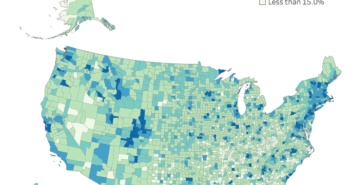
The data for this visualization comes from the American Community Survey which is conducted by the U.S. Census Bureau. I used the Census Bureau API to pull the 2016 1 year estimate for the percentage of people 25 years old and older with a bachelor’s degree. Once I had gathered the data, I used Tableau to create this visualization.
If you want to keep up with our surveys and data analysis, be sure to follow us on Twitter and Facebook.
What states have the most people with a Bachelor's Degree? #dataviz #TilemapTuesday https://t.co/DZYqGr75Mf pic.twitter.com/AoJcY6f1kI
— Overflow Data (@overflow_data) May 15, 2018


1 Comment
Having a degree doesn’t make you smart, just means you started life with a lot of debt.