Visualization
Mobile Users: If you are having issues using the interactive version of this visualization, you can find a static version of it here.
If you like this visualization be sure to check out a closer look at each state.
Data Notes
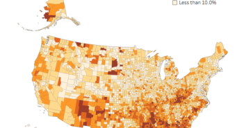
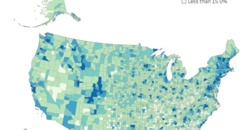
For this visualization I categorized people 15 to 34 years old are as Millennials. I found that almost 27% of people in the US fall into this age group. While Most states did not significantly differ from this I found that their were a lot of variation in the counties, especially smaller counties. This visualization lets you explore that with the ability to filter by gender and highlight by geography.
The data used in this visualization is compiled by the US Census Bureau. I used Table PEPAGESEX from American FactFinder to determine population counts by age. Once I had the data and the age groups I was going to use, I cleaned the data with Excel and used Tableau to create the visualization.
If you want to keep up with our surveys or data analysis be sure to follow us on Twitter and Facebook.
What States and Counties Have the Most Millennials? #dataviz https://t.co/NS9b12zEuI pic.twitter.com/lY8BfEaax9
— Overflow Data (@overflow_data) November 14, 2016


