See the Pen Unemployment Timeline by R Chase Sawyer (@overflowds) on CodePen.
If you like this Data Visualization be sure to check out the Interactive Version.
Data Notes
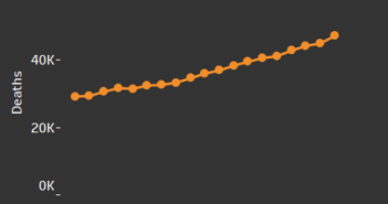
The idea for this post came from one I completed a few months ago about what the unemployment rate has been in each county in the US for the last 25 years. I used this data and the latest 2015 data from the Bureau of Labor Statistics to make this visualization. The data was cleaned in Excel and then Tableau was used to create the timeline. The data published by BLS is the average unemployment rate for the year. I then strung them together to make the timeline.
In addition to using Tableau and Excel, the website Codepen is used to host custom CSS and JS coding. The idea to do this came from Ben Sullins’ website. In a recent blog post, he explains how to use this coding and Tableau to create 50 state maps. I used this same idea to create timelines for each states unemeployment rate. Be sure to check out his site for more great ideas on using Tableau, CSS, and JS.
If you want to keep up with our surveys or data analysis be sure to follow us on Twitter and Facebook.
The Unemployment Rate in Each State Since 1990 #dataviz #jobsreport #unemployment https://t.co/ikk7gHwQHb pic.twitter.com/izjyhDEvDs
— Overflow Data (@overflow_data) November 5, 2016


1 Comment
Do you spread sheets take into account that in 2010 the Feds CHANGED the formula used for unemployment?
The unemployment rate is a complete lie now as it ignores
1- people without jobs for too long
2- people working part time who really want full time work – even if they’re looking, because, well, they have a job!
3- under employed, like people with college degrees working fast food.