
Data Notes
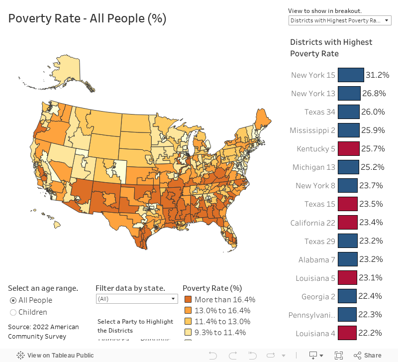
Last week, we published a data visualization that looked at what counties in the United States have the highest rates of poverty. One comment we heard from many of our viewers was that it would be interesting to see this breakdown by political party preference. To begin to understand this breakdown we created this tool that lets you view the poverty rate for each congressional district in the United States.
To create this visualization, I utilized a python script to access data from the Census Bureau’s API. I specifically gathered this data from the 2022 American Community Survey. I then created the visualization and hosted it using Tableau Public. Follow @overflow_data on X or on Instagram for other enlightening visualizations.