Introduction
A few weeks ago I came across a stat that said only about 30% of Americans have a bachelor’s degree. This seemed really low to me since it seems like most people I socialize and interact with have a bachelor’s degree or higher. I decided to take a look at how this stat varies by age.
Visualization
Analysis
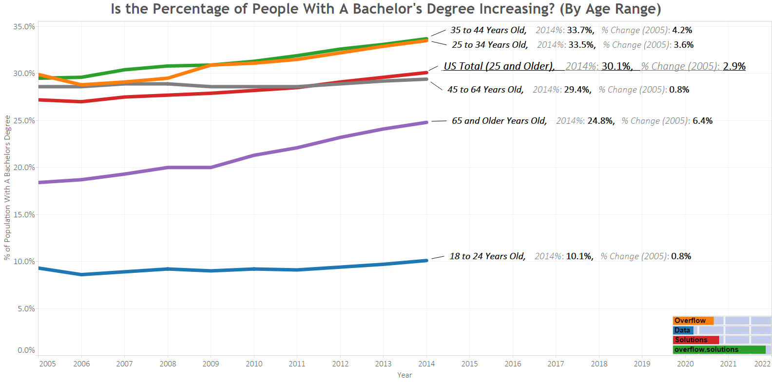
It is true that the percentage of the population has a bachelor’s degree is rising, but this doesn’t appear to be the only change that is causing the proportion of the population with a bachelor’s degree to rise based on my analysis of this graphic. Both the percentages of “25 to 34 year olds” and “35 to 44 year olds” have increased by 3.6% and 4.2% since 2005. There is an age group with a much bigger jump though over the last ten years.
The “65 and older” category has the largest growth over the last ten years at 6.4 percent. I don’t believe that this growth is from a large number of people in this population going back to school. It likely is due to more people with a bachelor’s degree entering the age range while the oldest individuals pass away. This likely is affecting the proportion of the population as well as modest growth in the number of people going to college.
Source
The data for this visualization comes from the American Community Survey which is conducted by the US Census Bureau. One year estimates from 2005-2014 were used to complete the time series. They can be found at American Fact Finder on Table S1501.
After downloading the data I created the time series in excel. Tableau was then used to create this visualization.
If you want to keep up with our surveys and data analysis, be sure to follow us on Twitter and Facebook.
Up Next
Is your county/state more educated then others?


