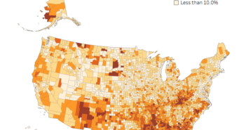
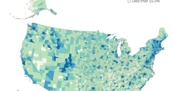
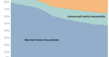
Mobile Users: If you are having issues using the interactive version of this visualization, you can find a static version of it here.
If you are interested in the trend line statistics you can find them below.
[accordions]
[accordion title=”Trend Line Statistics” load=”hide”]
Trend Lines Model
A linear trend model is computed for Percentage without Internet given Percentage in Poverty. The model may be significant at p <= 0.05.
| Model formula: | ( Percentage in Poverty + intercept ) |
| Number of modeled observations: | 819 |
| Number of filtered observations: | 0 |
| Model degrees of freedom: | 2 |
| Residual degrees of freedom (DF): | 817 |
| SSE (sum squared error): | 2.56574 |
| MSE (mean squared error): | 0.0031404 |
| R-Squared: | 0.452575 |
| Standard error: | 0.0560396 |
| p-value (significance): | < 0.0001 |
Individual trend lines:
| Panes | Line | Coefficients | ||||||
| Row | Column | p-value | DF | Term | Value | StdErr | t-value | p-value |
| Percentage without Internet | Percentage in Poverty | < 0.0001 | 817 | Percentage in Poverty | 0.922455 | 0.0354937 | 25.9893 | < 0.0001 |
| intercept | 0.0961313 | 0.0055128 | 17.4378 | < 0.0001 | ||||
[/accordion]
[/accordions]
Data Notes
The data for this visualization comes from the United States Census Bureau. It is gathered during the American Community Survey. I used 2015, 1 Year Estimates for each county with a population of more than 65,000 people. This can be found at American Fact Finder under Table S2801 and S1701. Once I had the data from the table, I cleaned it in Excel and used Tableau to create this visualization.
There are a couple of things worth noting when viewing this graphic. First, this is only the counties in the U.S. with a population of more than 65,000 people. Counties with less people than that are not available as a selectable geography in the ACS 1 year data files. Second, the percentage of poverty is only for people that the ACS could determine the poverty level. Finally, the percentage of people in poverty is a person level statistic and internet connection is a household level statistic. In some counties this could have an effect on the data, especially ones with above or below average household size. If you have any questions about these limitations or the data visualization be sure to leave a comment below or reach out to us on Twitter.
If you want to keep up with our surveys and data analysis, be sure to follow us on Twitter and Facebook.
How Poverty Status in Each U.S. County Relates to Internet Access #dataviz https://t.co/pXTyMKzQVW pic.twitter.com/J4ZtIvKqsl
— Overflow Data (@overflow_data) March 21, 2017


