Visualization
If you are having issues with the interactive visualization, click here for a static image.
Data Notes
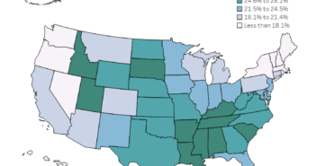
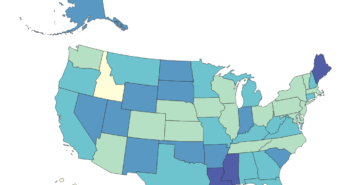
For Mothers’ Day, we wanted to take a look at how the fertility rate is changing over the next 10 years. To do this we took data from the American Community Survey which is conducted by the U.S. Census Bureau. The data can be found on American Fact Finder and we used Table S1301 for 2006 to 2010. Once the data was gathered and cleaned in Excel, this visualization was created in Tableau.
If you want to keep up with our surveys and data analysis, be sure to follow us on Twitter and Facebook.
How much has the fertility rate changed in the U.S. over the last 10 years? #dataviz #mothersday https://t.co/dYIfFm5hvB pic.twitter.com/Z1C5EEvXxV
— Overflow Data (@overflow_data) May 14, 2017


