How Much Education do Americans Have? – Visualized by Age – Gallery
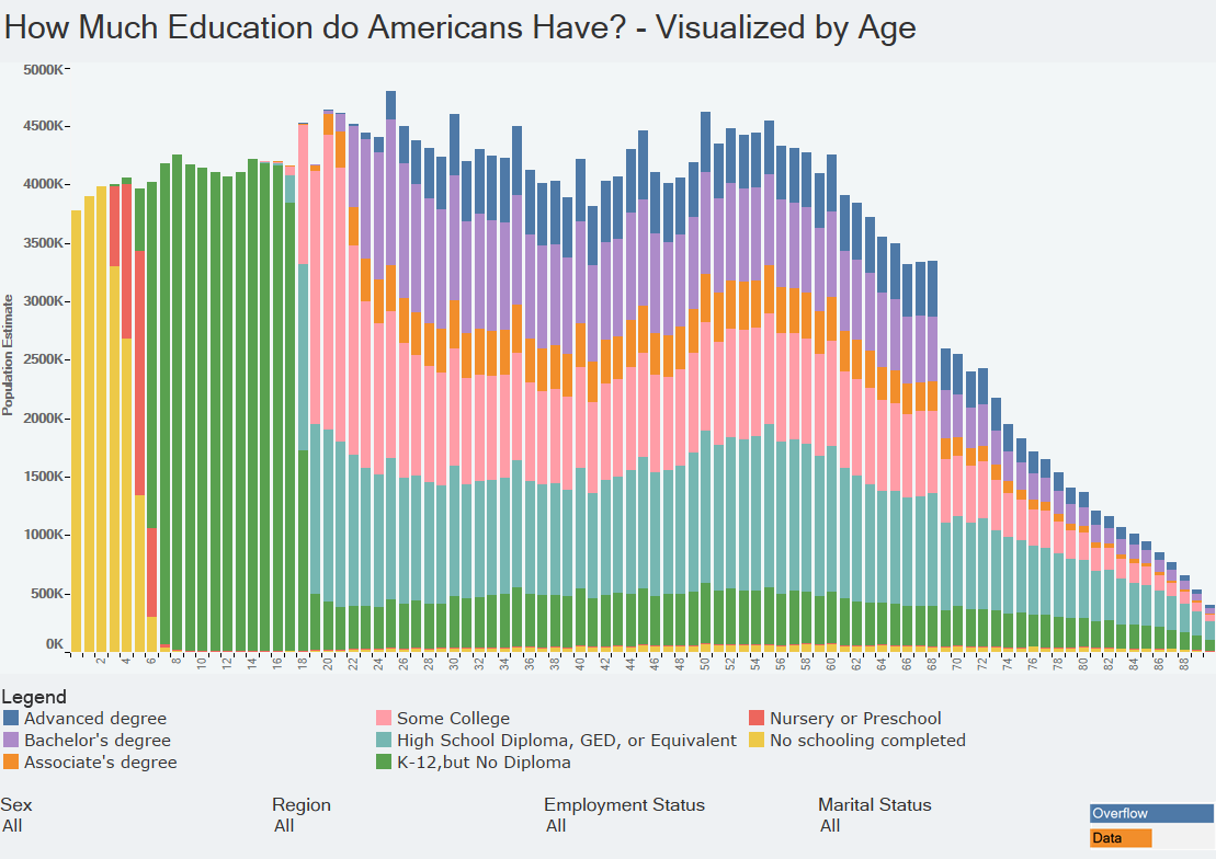
The gallery look at the highest level of educations Americans have visualized by how old they are.
The gallery look at the highest level of educations Americans have visualized by how old they are.
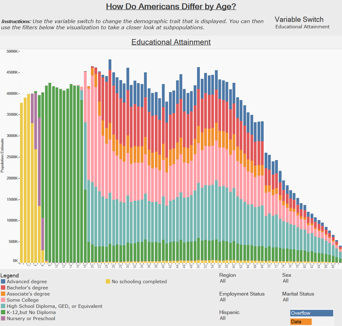
The gallery version of our visualization which shows different demographic traits on America’s Population Pyramid.
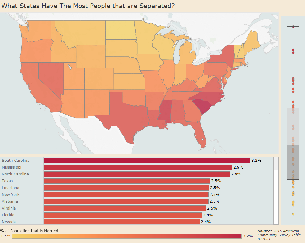
This visualization shows how the proportion of people that have separated from their partners in each state.
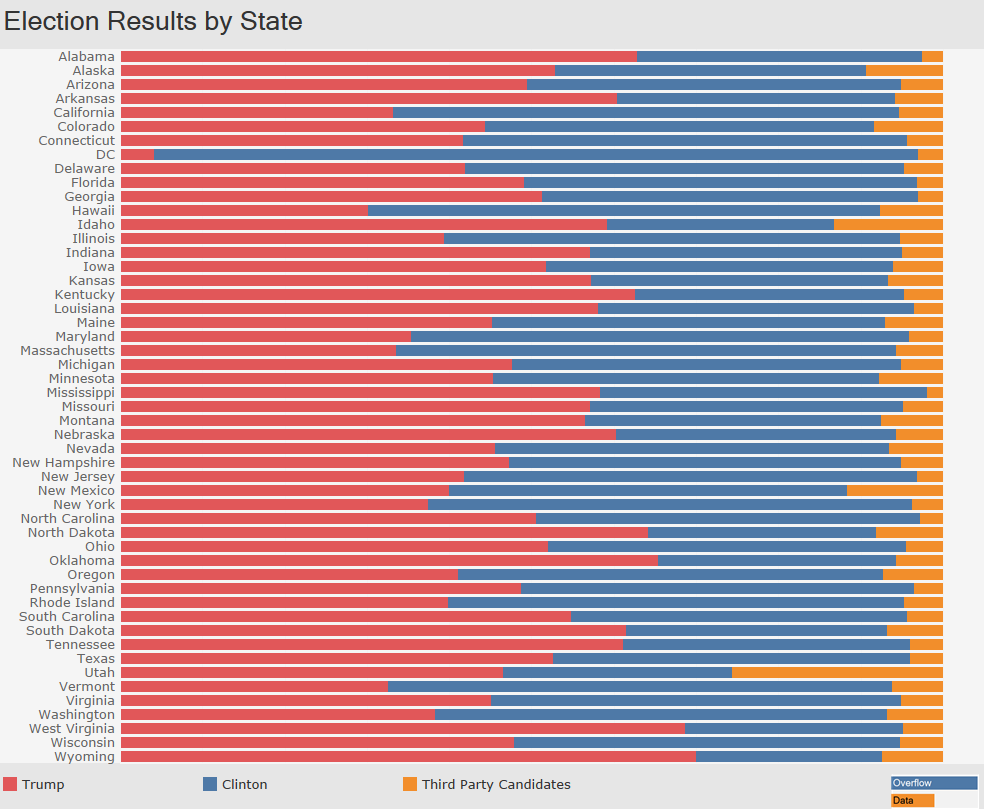
This is a look each party did in every state in the 2016 Presidential Election.
Copyright © 2026 | WordPress Theme by MH Themes