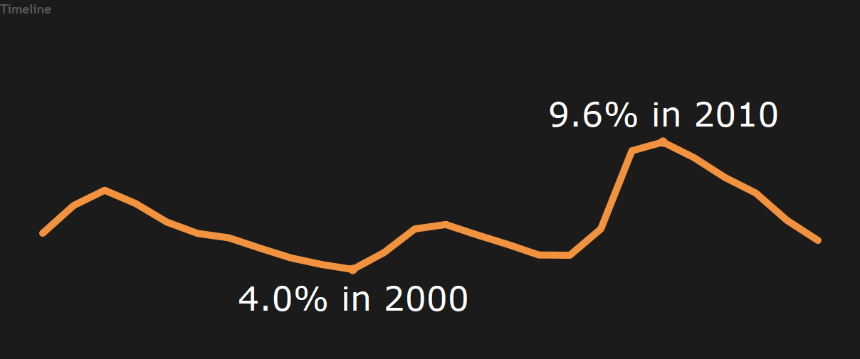
The Highs and the Lows of the Unemployment Rate
An interactive tool showing the high and low points of the unemployment rate since 1990.
.
An interactive tool showing the high and low points of the unemployment rate since 1990.
.
This visualization shows the unemployment rate for each state since 1990. It provided details on the low and the high point.
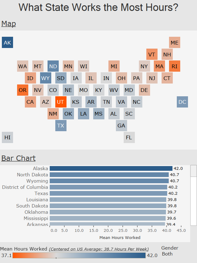
The average American worker spent 38.7 hours per week at work. Here is a look at how it differs by state.
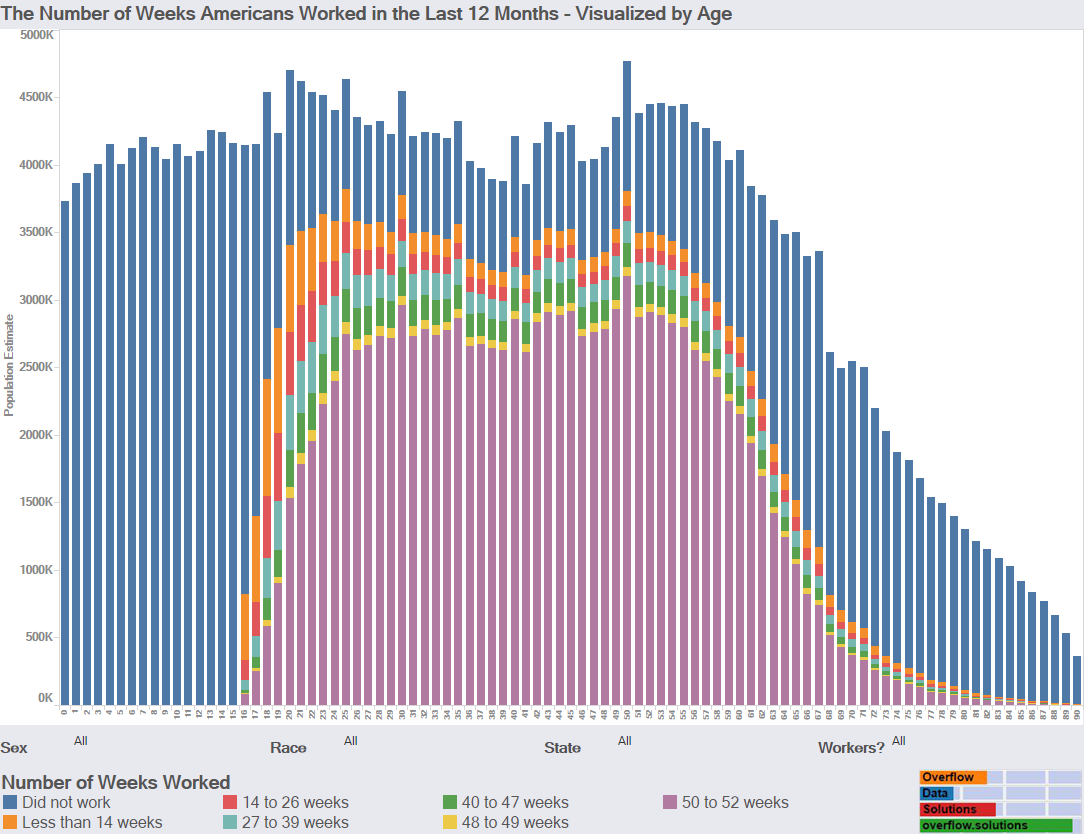
Introduction The American Community Survey estimates that 38.6% of people worked 50 to 52 weeks in the last 12 months ago. I decided I wanted […]
Copyright © 2026 | WordPress Theme by MH Themes