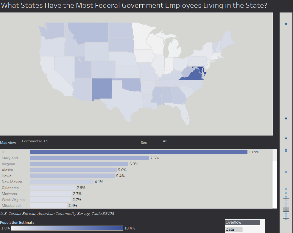
What States Have the Most Federal Workers Living There?
A look at where federal workers live and how that number can change in each state.
A look at where federal workers live and how that number can change in each state.
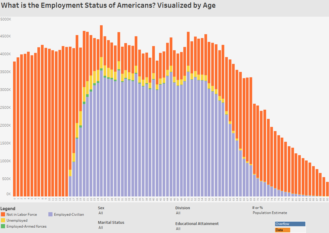
A look at how many Americans are unemployed, not part of the labor force, and have a job by their age.
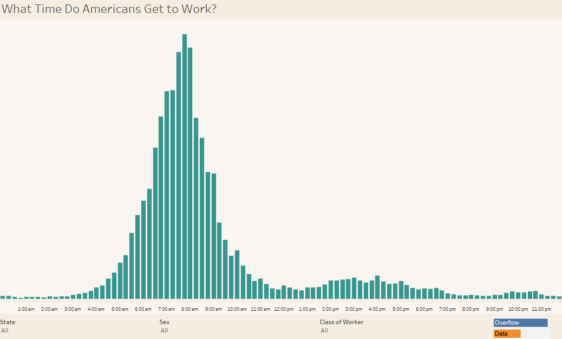
This data visualization shows what time Americans around the nation get to their workplace every day.
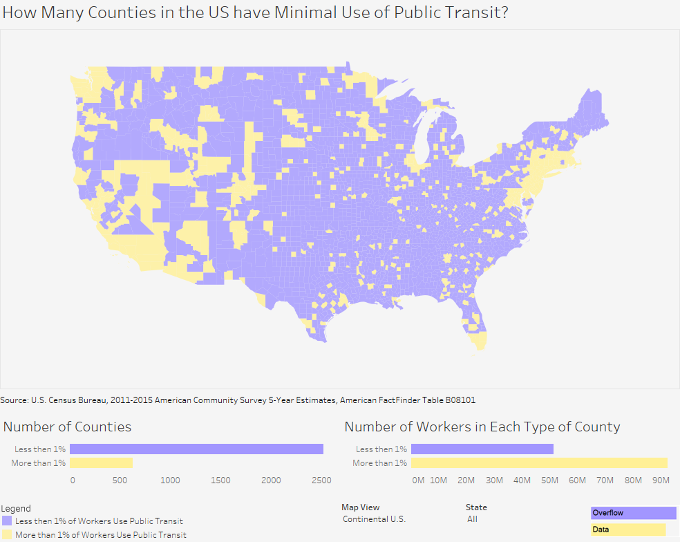
In 80% of counties in the U.S., less than 1% of the population uses public transit to get to work. This data visualization explores public transit use and the number of workers in these counties.
Copyright © 2026 | WordPress Theme by MH Themes