
Visualization
If you are having issues with the interactive visualization, click here for the static version.
Data Notes
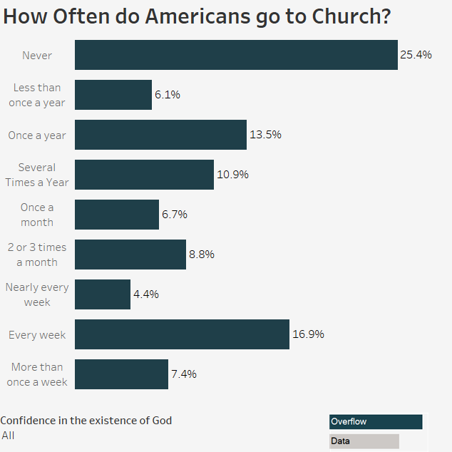
The General Social Survey has been publishing a vast array of data since the 1970s. I decided I wanted to create a visualization that shows how often Americans go to religious services. I used data from the GSS question, “How often do you attend religious services?” to create this visualization. I decided to make it a little more interesting by adding a filter that lets you see the results by how confident the respondent was that God exists. I used the GSS Explorer website to download the 2016 data they have on the subject. Once I had the data, I used Tableau to create the visualization.
If you want to keep up with our surveys and data analysis, be sure to follow us on Twitter and Facebook.
How Often do Americans go to Church? #dataviz https://t.co/7IHd9NYo6z pic.twitter.com/D0eX04e8zS
— Overflow Data (@overflow_data) April 30, 2017
Leave a Reply