Visualization
[accordions]
[accordion title=”Less than a High School Diploma or GED” load=”show”]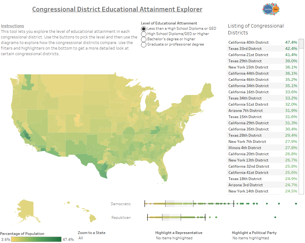
[/accordion]
[accordion title=”High School Diploma/GED or Higher” load=”hide”]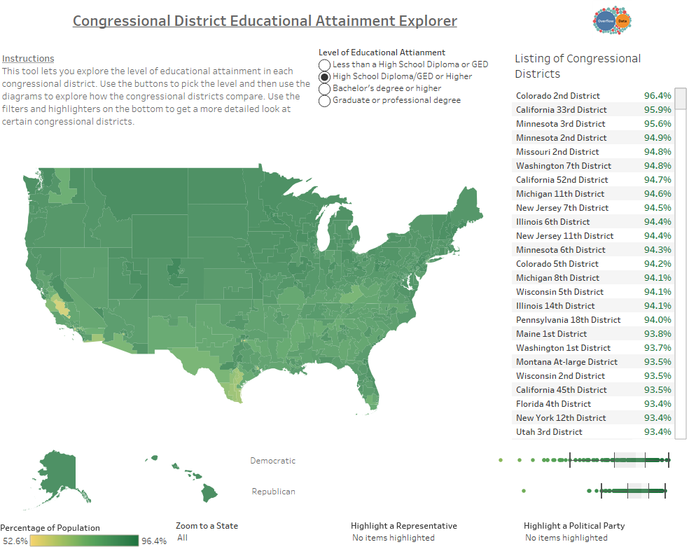
[/accordion]
[accordion title=”Bachelor’s Degree or Higher” load=”hide”]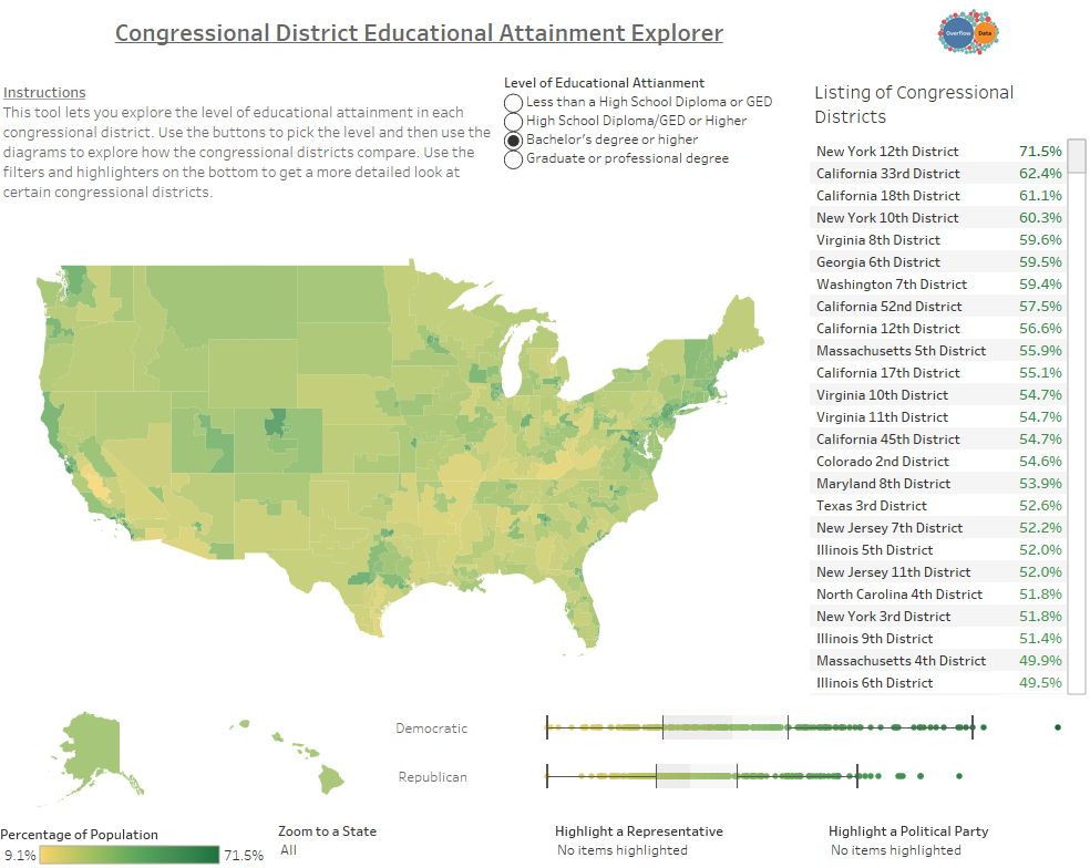
[/accordion]
[accordion title=”Graduate or Professional Degree” load=”hide”]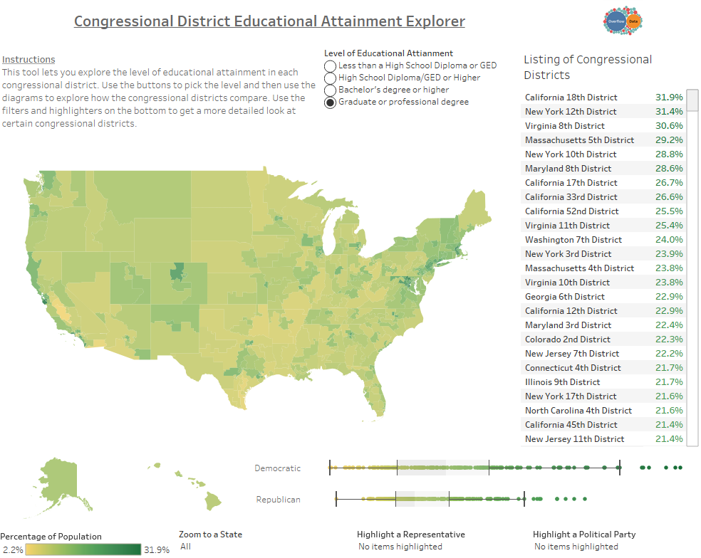 [/accordion]
[/accordions]
Data Notes
Earlier this week, I created a visualization showing how many people had a bachelor’s degree in each congressional district. It seemed like a fair amount of people wrote it off as showing that Democrats are more educated then Republicans. Since this wasn’t the point of my visualization and since it only shows part of the picture I decided to expand it to show different levels of educational attainment.
For this visualization, I used Tableau to create a represent data from the 2015 American Community Survey that shows what congressional districts have a higher educational attainment based on 4 different metrics.
These metrics are:
- Less than a High School Diploma or GED
- High School Diploma/GED or Higher
- Bachelor’s Degree or Higher
- Graduate or Professional Degree
If you want to keep up with our surveys and data analysis, be sure to follow us on Twitter and Facebook.
Congressional District Educational Attainment Explorer #dataviz https://t.co/HBdgiDfpLQ pic.twitter.com/tYQgGEx04A
— Overflow Data (@overflow_data) May 17, 2017
