")
Introduction
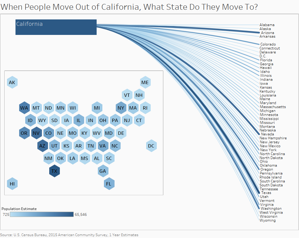
I wanted to make a data visualization that showed where people move when they leave a state. The tool below, lets you choose the state you would like to see data for within the box below. The graphic then adjusts to show where people moved both on the map and the bar chart. You can then find our more about how many people moved to that state while clicking on that state.
This mobile view is only a portion of the data visualization that I created to show these trend. You can see a graphic of the desktop visualization here. I hope you come back to see the desktop version later on.
Visualization
Mobile Users: If you are having issues using the interactive version of this visualization, please try rotating your screen view or you can find a static version of the visualization here.
Data Notes
The data used in this visualization is compiled by the US Census Bureau which produces the American Community Survey. I used data I found on the Census Bureau’s website. I then utilized Excel to clean the data and Tableau to create the visualization.
If you want to keep up with our surveys or data analysis, be sure to follow us on Twitter and Facebook.
When People Move Out of State, What States Do They Move To? #dataviz https://t.co/B5pMvSvZuO pic.twitter.com/g37kVAyB0F
— Overflow Data (@overflow_data) January 25, 2017
Leave a Reply