Visualization
Mobile Users: If you are having issues using the interactive version of this visualization, you can find a static version here.
Data Notes
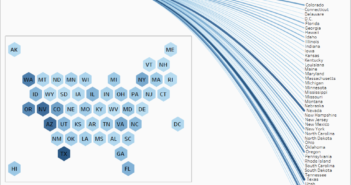
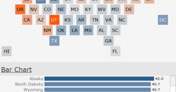
I was inspired by reddit user, u/iturki27’s post of the “Worldwide Human Sex Ratio” to create one of the states and counties in the Continental U.S. I used American Community Survey Data which is compiled by the U.S. Census Bureau. I gathered the 2011-2015 estimates from Table B01001 which can be found at American FactFinder. I then used Tableau to create the visualization.
If you want to keep up with our surveys and data analysis, be sure to follow us on Twitter and Facebook.
What is the the Sex Ratio of Each State and County in the U.S.? #dataviz https://t.co/iB5afu2Wda pic.twitter.com/lP2yFT3ylF
— Overflow Data (@overflow_data) January 10, 2017

