
Visualization
[accordions]
[accordion title=”Mobile” load=”show”]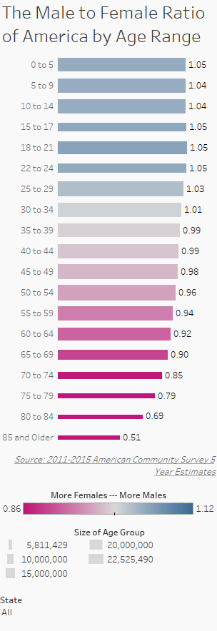
[/accordion]
[accordion title=”Desktop” load=”hide”]
 [/accordion]
[/accordions]
Data Notes
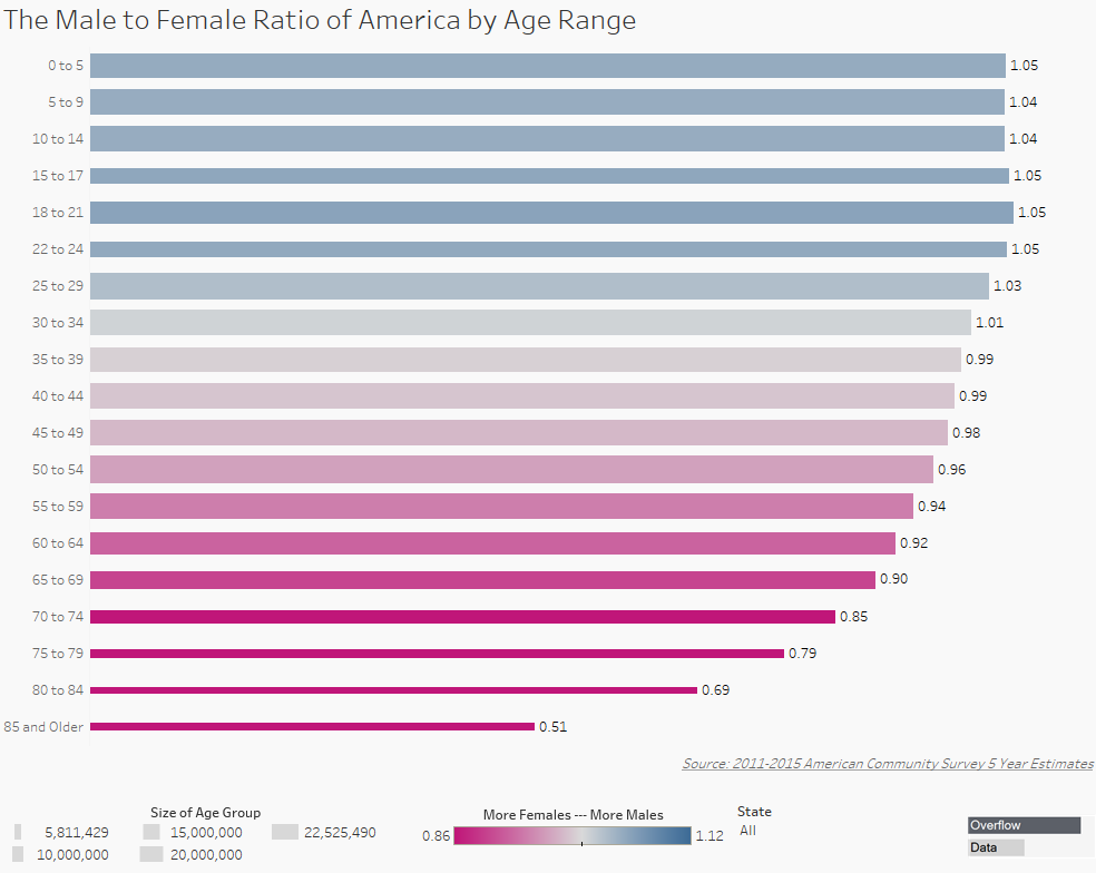
Last week, I was inspired by Reddit user, u/iturki27’s post of the “Worldwide Human Sex Ratio” to create a map that showed the gender ratio of the states and counties in the Continental U.S. While I was making that I realized that there are some major differences in the data if you control for age range. That is when I decided to make this graphic which shows the differences.
I used American Community Survey data which is compiled by the U.S. Census Bureau for my dataset. I gathered the 2011-2015 estimates from Table B01001 which can be found at American FactFinder. I then used Tableau to create the visualization.
If you want to keep up with our surveys and data analysis, be sure to follow us on Twitter and Facebook.
<
The Male to Female Ratio of America by Age Range #dataviz https://t.co/Wab7ffVHKU pic.twitter.com/YBQ4eMFvUs
— Overflow Data (@overflow_data) January 16, 2017
Leave a Reply