Introduction
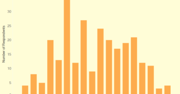
There have been multiple studies that show a person’s age effects what they perceive as “old”. I thought it would be cool to create a visualization that shows this by displaying the age of the respondent and the the age at which they perceive someone to be old. To do this, I published a survey in the subreddit, r/samplesize. Below, you can find the survey, if you would like to take it and the visualization I created. The visualization has some basic distributions of the responses on one tab and a second tab has the heat map.
Survey
[accordions]
[accordion title=”If you want to take the survey before viewing the visualization, click here!” load=”hide”]
[/accordion]
[/accordions]
Visualization
Data Notes
To recap, the data for this visualization was gathered in google forms and linked to google sheets. The original respondents came from a survey posted on r/samplesize. Once I had the data I used Tableau to create the visualizations. If you would like the raw data you can find it here.
If you want to keep up with our surveys and data analysis, be sure to follow us on Twitter and Facebook.
How old is "old"? #dataviz https://t.co/LRNm3rWHs4 pic.twitter.com/wzQ3N1QMpD
— Overflow Data (@overflow_data) September 28, 2017


