
Visualization
Data Notes
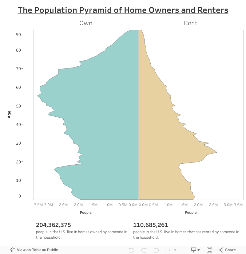
Most of the time, population pyramids look at the difference in age between men and woman. After recently creating a visualization that looked at the number of people in a home and the numbers of room that home had, I decided I wanted to investigate more differences between home owners and renters.
This visualization shows the number of people that live in homes that are owned or rented by the age of the people living in them. The graphic uses the 2016 ACS Public Use Microdata Sample which is created by the U.S. Census Bureau. It is rendered using Tableau Public.
It needs to be pointed out that this only shows the people that live in homes. It does not try to represent people that live in group quarters facilities like college dorms and nursing homes.
If you want to keep up with our surveys and data analysis, be sure to follow us on Twitter and Facebook.
The Population Pyramid of Home Owners and Renters #dataviz https://t.co/ITbyETg3ax pic.twitter.com/U14wKzqizA
— Overflow Data (@overflow_data) May 11, 2018
Leave a Reply