
Visualization
Data Notes
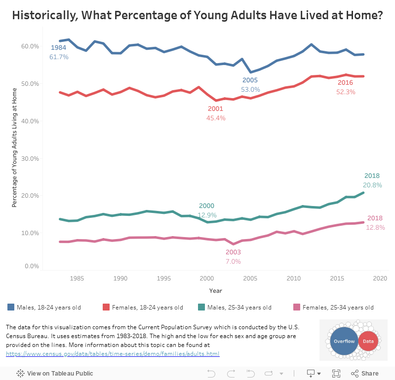
The data for this visualization comes from the Current Population Survey which is conducted by the U.S. Census Bureau. It uses estimates from 1983-2018. The high and the low for each sex and age group are provided on the lines. More information about this topic can be found here. I used Excel to make get the data in a usable form and Tableau to create the visualization.
If you want to keep up with our surveys and data analysis, be sure to follow us on Twitter and Facebook.
Historically, What Percentage of Young Adults Have Lived at Home? #dataviz https://t.co/qjY1bHNnff pic.twitter.com/W8m8lPhniB
— Overflow Data (@overflow_data) December 7, 2018
Leave a Reply