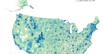
Visualization
If you are having issues with the interactive visualization, click here for a static image.
Data Notes
I wanted to see how school enrollment changes based on age in the U.S. so I created this data visualization. It takes the age distribution of the United States and imposes there school enrollment status. I used the 2015 ACS Public Use Microdata Sample as my data source. The data can be found on the ACS Website. Once I had the data I then utilized Tableau to visualize it.
If you want to keep up with our surveys and data analysis, be sure to follow us on Twitter and Facebook.
How does school attendance change with age in the U.S.? #dataviz https://t.co/a3amFkOolU pic.twitter.com/NdpOhwhlO1
— Overflow Data (@overflow_data) July 14, 2017


