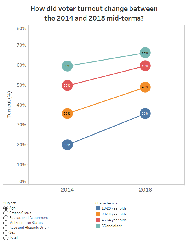
How did voter turnout change between the 2014 and 2018 mid-terms?
New data shows how voter turnout changed between the 2014 and 2018 mid-term elections. This data visualization explores how voter turnout changed for different demographic groups.
New data shows how voter turnout changed between the 2014 and 2018 mid-term elections. This data visualization explores how voter turnout changed for different demographic groups.
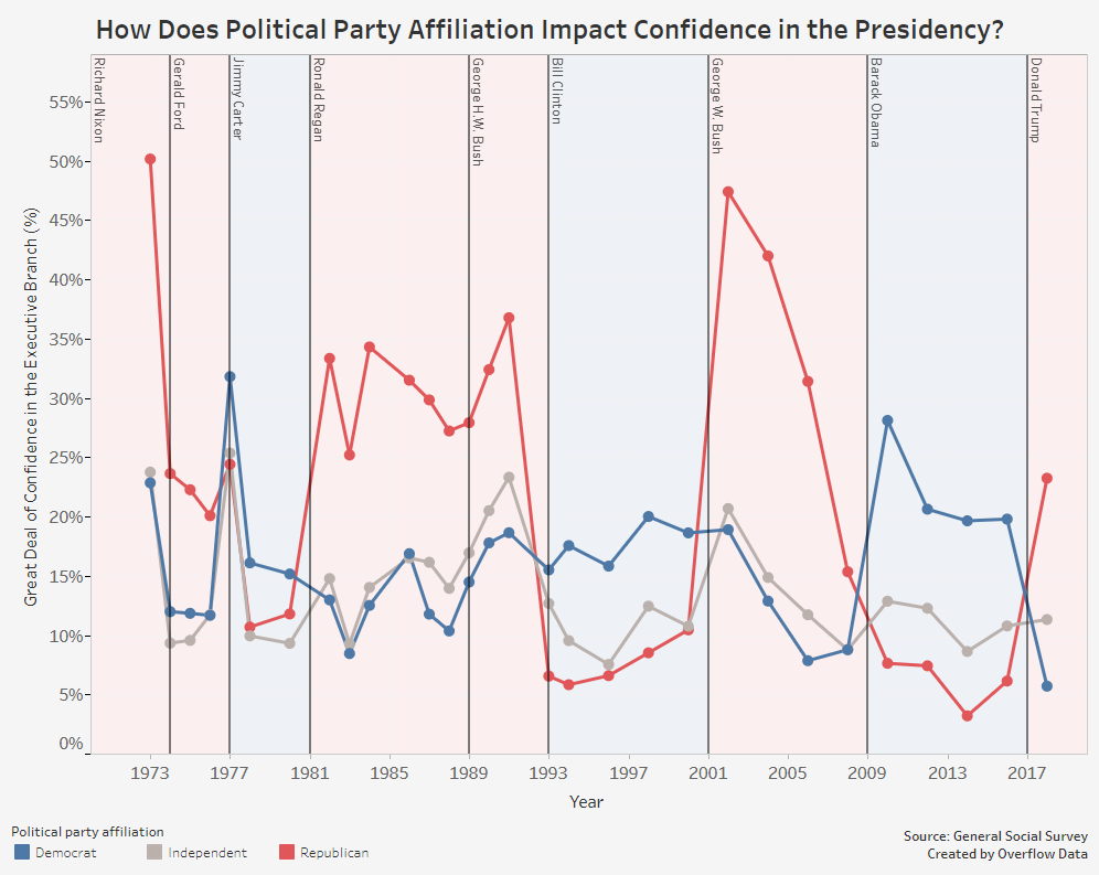
A look at how political party affiliation impacts the confidence people have in the executive branch.
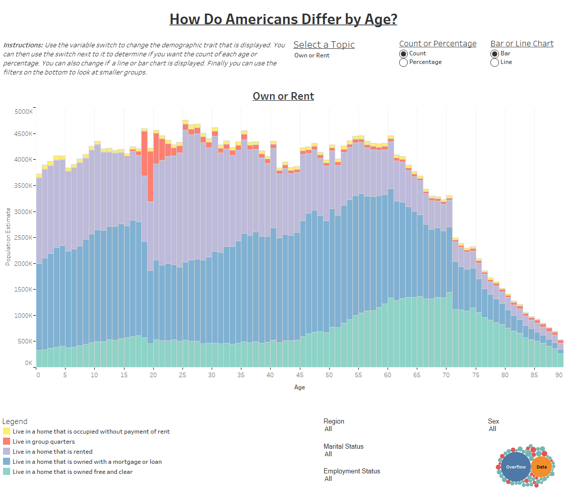
Americans change as they age. This visualizations track those changes in the U.S. for 15 different traits.
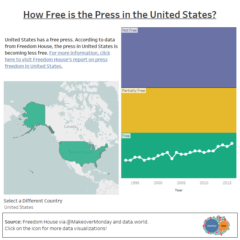
My Makeover Monday submission for 2019, Week 2 which focuses of freedom of the press through out the world.
Copyright © 2026 | WordPress Theme by MH Themes